What Are Heatmaps? How They Work and Ways You Can Use Them
What are Heatmaps?
Heatmaps are visual representations of what your users are doing on your site. Heatmaps use colors to display the relative frequency of clicks to different elements on a page, how far users typically scroll down the page, and which parts of the page draw users’ attention.
Heatmaps are a color based representation of user activities on your site or mobile app. Traditionally Heatmaps visualize user data by using a range of color—warmer tones for areas of higher engagement and cooler tones for areas of lower engagement. Heatmaps show you where users click the most, how far they scroll down, or what pages or sections they tend to ignore.

Heatmaps are a popular option for companies who want to quickly identify what’s working well and what isn’t. With a glance, you can instantly see which areas are capturing your users’ attention. Heatmaps are also a wonderful tool for prioritizing work, as you can instantly see which parts of a page or website need more attention.
Why are heatmaps useful?
The simple answer is: when you get a good visual on what your users are actually doing, you can make better decisions. For example, if your heatmaps show that people only scroll a third of the way down a page, you can safely assume that most folks aren’t seeing the CTA you’ve placed at the very bottom. You can then experiment with different ways to organize the page.
Heatmaps can be incredibly useful for companies looking to understand user behavior at a glance. Here are some of the key benefits heatmaps offer.
They’re an easy way to see and analyze user behavior
Heatmaps are designed for speed. Through color representation, they paint a picture of the most popular and unpopular areas of your site and mobile app. By looking at your heatmaps, you can quickly and easily understand where users click on the most and least, how they navigate the page, and where they stop scrolling and drop off – all without diving into charts and graphs.
They save you time
Heatmaps save a huge amount of time. Before heatmaps were developed, teams could only understand user behavior by analyzing quantitative data - defining events, building queries, or counting how many people clicked on every part of a page. The process was time consuming and monotonous. Now, heatmaps give you a sense of what’s happening on your site or mobile app quickly, letting you answer questions like:
What do users see? Do users tend to scroll down to a particular point of the page, or spend time reading a certain block of copy?
What parts of the page do users interact with most?
What interaction patterns are most common on a given page?
They identify problem areas and trends
Heatmaps can show you what’s going well, but they can also help you identify problem areas that might not be immediately apparent from raw data. For example, while raw data will show you that you’ve had a certain number of visitors in a day, heatmaps will show you where those visitors are engaging—and where they’re not. This could then prompt an action plan to redesign the homepage, or move CTAs around to capture peoples’ attention.
They let you quickly generate and test hypotheses about user behavior
One of the best uses of heatmaps is to test different features of a page to see how they perform. Teams can easily see which CTAs get the most interest from users, for example, or whether videos get clicked on more than text.
Three different types of heatmaps (and how to read them)
Heatmaps can come in various forms. Here are three types of heatmaps to look out for.
1. Click maps (mouse position maps)
Clicks maps show you where users click on a page. They work by tracking the numbers of clicks users make, then showing you that information in a color-coded overlay.
Click maps are useful in nearly all industries. If you’re an ecommerce company, for example, you might use click maps to see if users click on certain colors of a specific item more than others. If you’re a SaaS company, you might see which feature pages users engage with.
Click maps also help you see if users are clicking on dead or non-reactive parts of your website, or what elements you might want to define and analyze further.
How to read click maps
Heatmaps usually use warmer colors (reds and oranges) for most-clicked places on your site and cooler colors (blues and whites) for areas that generated fewer clicks.

2. Scroll maps (mouse position maps)
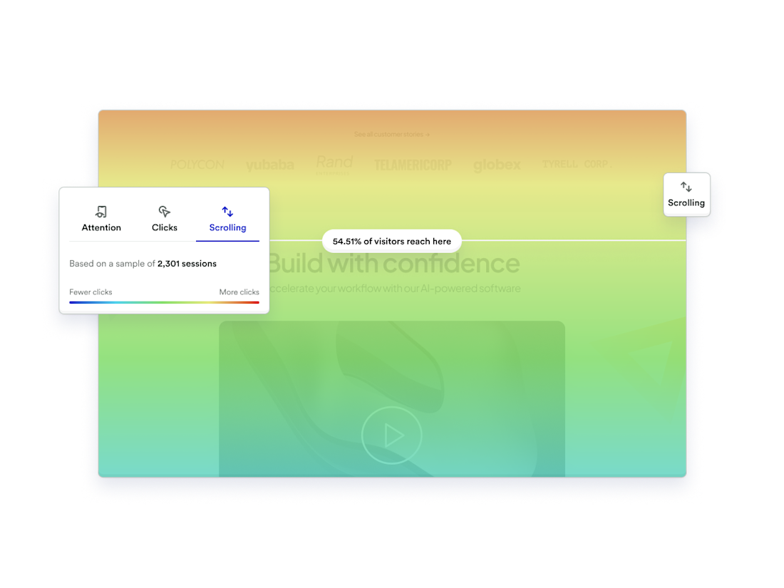
Scroll maps track how far down the page users scroll. They usually use color to show where different percentages of people stop scrolling. Scroll maps are useful for learning what elements of the page users are most likely to see, and what rough percentage of your users make it to a given part of the page.
How to read scroll maps
The areas above the fold display warmer colors, as more users see this part of the page. Below the fold you see cooler colors, which indicate that fewer people scroll that far down.

3. Movement maps (attention maps)
Attention heatmaps track all cursor movement (and by extension, eye movement) across your pages. Movement maps look similar to click maps, but they also track the direction and pattern of cursor movement across your pages. This helps you answer questions like:
Where do people drag their cursor on the page? Is it from left to right or do they keep to one side of the page?
What words, sections, and paragraphs are people hovering their cursor over?
Which blocks of text caught the users’ attention the most?
How to read movement maps
Though they look like click maps, movement maps track all cursor movement, not just clicks. Here, for example, warmer colors represent areas where users click or hover. The cooler colors indicate parts of the page where fewer users move their mouse.

How different teams can use heatmaps
Heatmaps are useful for different teams and roles. Here's a quick breakdown.
Product teams
PMs, especially less technical PMs, can quickly understand user behavior without needing to define events, know SQLs, or build queries on their own.
Design teams
Designers tend to care a lot about how users experience a page. Heatmaps give them a way to understand user behavior visually.
Data teams
Because heatmaps provide product and design teams with instant data insights, they eliminating the need for those teams to reach out to data teams for information. This tends to save time for data teams. Data teams also sometimes use heatmaps to gain insights into specific data points, such as page traffic.
Growth teams
Growth teams tend to run a lot of webpage experiments, and tend to follow high-level usage and traffic metrics. Because heatmaps are built to provide this high-level information, growth teams can get insights they need without having to sift through volumes of data.
How heatmaps fit into your tech stack
Heatmap software is designed to work well with your existing analytics and design tools. On their own, heatmaps are effective at giving you a snapshot of user engagement across your site and mobile app. But when supplemented with other tools within your tech stack, heatmaps can offer massive value. Here are just a few:
Session Replay. Although not supported by all providers, Session Replay is a handy tool that works well in conjunction with heatmaps. Heatmaps will show you where users engage with the most through scrolling, movement, and clicks. Session Replay will then help you get a more in-depth visual on what users are doing through user recordings.
A/B testing. If you have an A/B testing tool, heatmaps is a natural pairing, in two ways. First, heatmaps can show you which parts of your site most need A/B testing. Second, heatmaps can quickly show you the results of a given test.
Digital analytics. The best heatmaps tools are paired with more quantitative analytics, so you can go back and forth between the two. In this scenario, a heatmap can show you which parts of your site users engage with, then more quantitative tools can show you what users do before and after engaging that part of the site, which segments of users most engage (or least engage), the conversion rates of users who do and don’t engage, and so on.
Autocapture. Some heatmaps are powered by autocapture, which enables you to see all user activity across every page on your site. This helps you avoid any time wasting from manually tagging which events to analyze, and ensures your heatmap is as accurate as possible.
How to get the most from your heatmaps
For heatmaps to be effective, you need to know how to use them in the right way. We’ve covered what tools they work well with. Now let’s go over a few technical requirements that will ensure you get the most from your heatmaps.
Ensure Session Replay is working properly before generating heatmaps
Heatmaps are most useful when they aggregate hundreds or thousands of sessions, so ensure you have enough data to look at
Run heatmaps on static pages rather than highly dynamic or customizable pages for best results
How to create heatmaps for your website
Whatever heatmap tool you use, the process of setting up and using it should be simple. Here are eight steps that will get your heatmaps up and running.

Choose a heatmap solution. For a competitive comparison on the best heatmap tools out there, go to the bottom of this article.
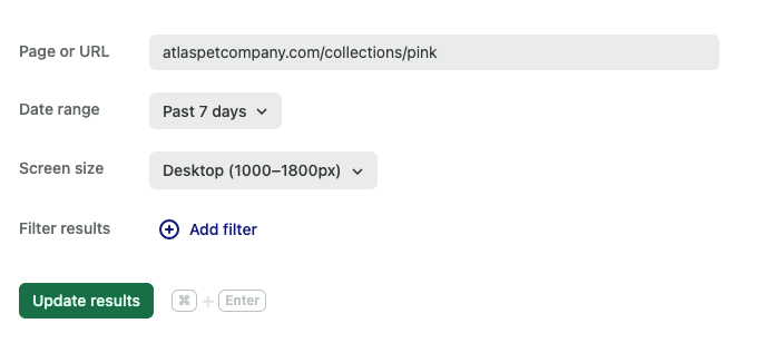
Decide which page or URL you’d like to analyze. You can select multiple pages if you'd like.
Select the date range. Keep in mind that there may be limitations on the date range available to you depending on when you purchased the heatmap tool.
Choose the screen size. Choose whether you’re looking at user activity on desktop, tablet, or mobile.
Generate your results. Now that you've provided the inputs for your heatmap, you can click the "generate heatmap" button and wait for the tool to process your data.
Filter your results. Limit the users you'd like to include in the analysis by looking at new users vs. returning users, users from different regions, or logged-in vs. logged-out users.
Analyze sessions and match moments. Take a look at your heatmaps and toggle between clicks, scrolls, and movement to get an understanding of how your users are engaging with your sight.
Repeat when necessary. If your heatmap is powered by autocapture, then you can rest assured that data is being collected at all times. You can then choose to analyze heatmap data on any page or product whenever you feel necessary.
The best heatmap tools
Although all heatmap tools are similar in what they provide for your business, there are some out there that are better than others. Here’s a breakdown of the top few on the market.
Heap
Heap is a product analytics platform that gives your product, marketing and customer success teams access to 100% of your customer data, 100% of the time. When it comes to heatmaps, Heap helps you dig deeper than just regular heatmaps. Here’s a snapshot of some of the top features.
Best in class autocapture
Never manually track anything again. With Heap’s autocapture ability, you can rely on one line of code that opens the door for tracking all user activity across every inch of your website, all of the time.
Increase engagement across your website and product suite
Using heatmaps, you can rely on accurate user data collected by autocapture to build stronger products that will help scale your company.
True self service governance
With heatmaps, you can ensure the most up to date data is always available and accessible to everyone.
Improve retention across all stages of the lifecycle
Heap’s data collection capabilities mean heatmaps show you everything you need to know to improve any section you’re seeing low engagement and drop off.
Data democratization
With heatmaps, you can ensure the most up-to-date data is always available and accessible to everyone.
Encourage a positive experience that make your products sticky
With Heap’s insights, you can drastically improve your customer experience that will make folks use your product again and again.
World class analytics
Heap offers the best analytics solution to work in tandem with heatmaps, with built-in modules, automated insights and features like Session Replay and heatmaps.
Perform cross channel conversion rate optimization
Optimize conversion rates to drive revenue and turn high quantity traffic into high quality customers.
Fullstory
FullStory is a “find and fix” digital analytics tool. The platform allows users to find friction points in the customer journey and use features like Session Replay to replicate the problem and remedy it. FullStory is weaker than other competitors when it comes to product analytics because they only provide high level insights. FullStory is also heavily geared toward consumer goods companies. This means that businesses in any other industry or who need more in depth analytics should look at other solutions.
Provides top level analytics about any page or URL
Analyzes conversion funnels
Detects signals of friction in your UI
Visualizes aggregate user trends over time
Find and fix friction points
High level analytics (if you don’t want granularity)
Good for consumer goods companies
Hotjar
Hotjar is a low data analysis tool that provides heatmaps, session replay, and voice of customer features to help locate areas for improvement. The tool is aimed towards digital analysts, UX designers, and web developers. Because it doesn’t provide granular insights and only offers high level filtering and slice and dice analytics, it isn’t a great tool for product teams looking to get into the weeds of customer analytics.
Filtering capabilities with session replay
Has HotJar polls, a way to speak to the user during their session and collect feedback
Video recording with transcription
Ability to build surveys
Companies that want to stay at low maturity
Companies just starting out who aren’t interested in growing
Contentsquare
Contentsquare is a digital analytics cloud service that offers session replay and heatmaps amongst a suite of product offerings. The platform is best used by data analysts and UX designers, as it doesn’t have an overly user-friendly interface and can be complicated to navigate if you aren’t familiar with the different modules on the platform. Because of this, it isn’t the best tool for product or marketing teams.
Mobile reporting and segmentation
Heatmaps and monitoring
Basic Session Replay
Businesses who want basic quantitative insights on user behavior
Companies who want to prioritize finding what’s broken rather than what to fix next.
This feature is not included
Heatmaps are an excellent visual tool for understanding user behavior and optimizing your website for better engagement and conversions. While not effective as a standalone product, Heatmaps work exceptionally well in tandem with other analytics tools like Session Replay. They allow you to quickly analyze user behavior and identify problem areas or trends that could be missed.
Want to see a live demo of Heap’s Heatmaps in action? Click here to learn how you can start using heatmaps to improve your website's performance today.
Watch a live demo
Interested to see how Heap’s Heatmaps work? Watch a live demo today.
