We Turned Our Front-End Code Into a Component Library (and You Can, Too)
Component libraries make building and maintaining a large web app easier. They reduce the one-off work needed to build new features and maintain consistency throughout the app.
But turning a codebase without a component library into a codebase with a component library can be a daunting task, especially when you consider the organizational challenge of getting engineers across different teams to actually start using the library as a part of their work.
Where do you start? Here’s how we did it.
But first, why now?
For a large part of Heap’s history, we had a single team that worked on the front-end parts of the product. But Heap is growing, and we now have multiple teams that do front-end work. A component library is essential for maintaining a consistent, easy to develop app while scaling up our teams.
Plus, we have a bigger Design team now, and they’ve built out a UI kit to make designs more consistent. A component library allows us to fully leverage the advantages of that UI kit.
If Design wants to change the look of a component in the UI Kit, we can make a single corresponding change to a component in the component library and have that change instantly reflected everywhere in the app.
Getting started
We wanted our component library to be part of a larger design system that is co-owned by Engineering and Design, but ultimately driven by our Design team. What that means is that while Engineering and Design work together on making a set of visual building blocks for our app, Design leads the way on determining what those building blocks should be.
So when planning our component library, we started with another part of the design system — the UI kit our designers use for building mocks in Figma.
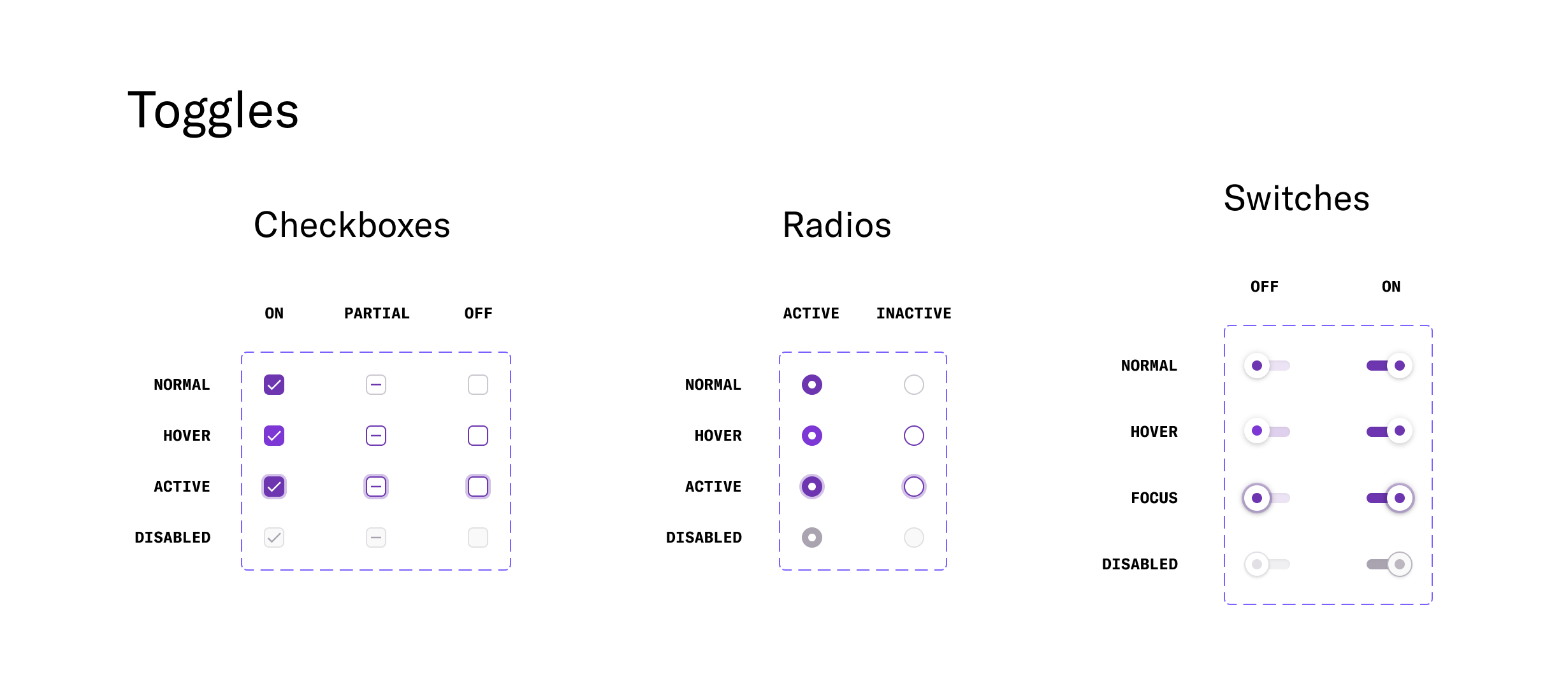
With the goal of eventually having a 1:1 correspondence between the UI kit and the component library, we worked with our design team to create a shortlist of components that were good candidates for version one of the component library, based on the state of both the existing code component and existing UI kit element.
Before putting these components in a library, we had to decide on what it even meant for a component to be in the library. We use a monorepo, so pulling the code out into a separate repository wasn’t the right option. We settled on a dedicated directory in our main repository. Then we worked on creating standards for contributing code to that directory.
Contribution guidelines
We created some guidelines for contributing components to the library to reinforce our goal of making the components easy to reuse.
Isolation.Code in the library should not have any dependencies on other parts of the codebase. We enforce this using the eslint
no-restricted-importsrule.Examples. Each component should have a comprehensive set of stories that capture all of its various states. This includes a “sandbox” story where a viewer can see how each of the component’s props affects its appearance.
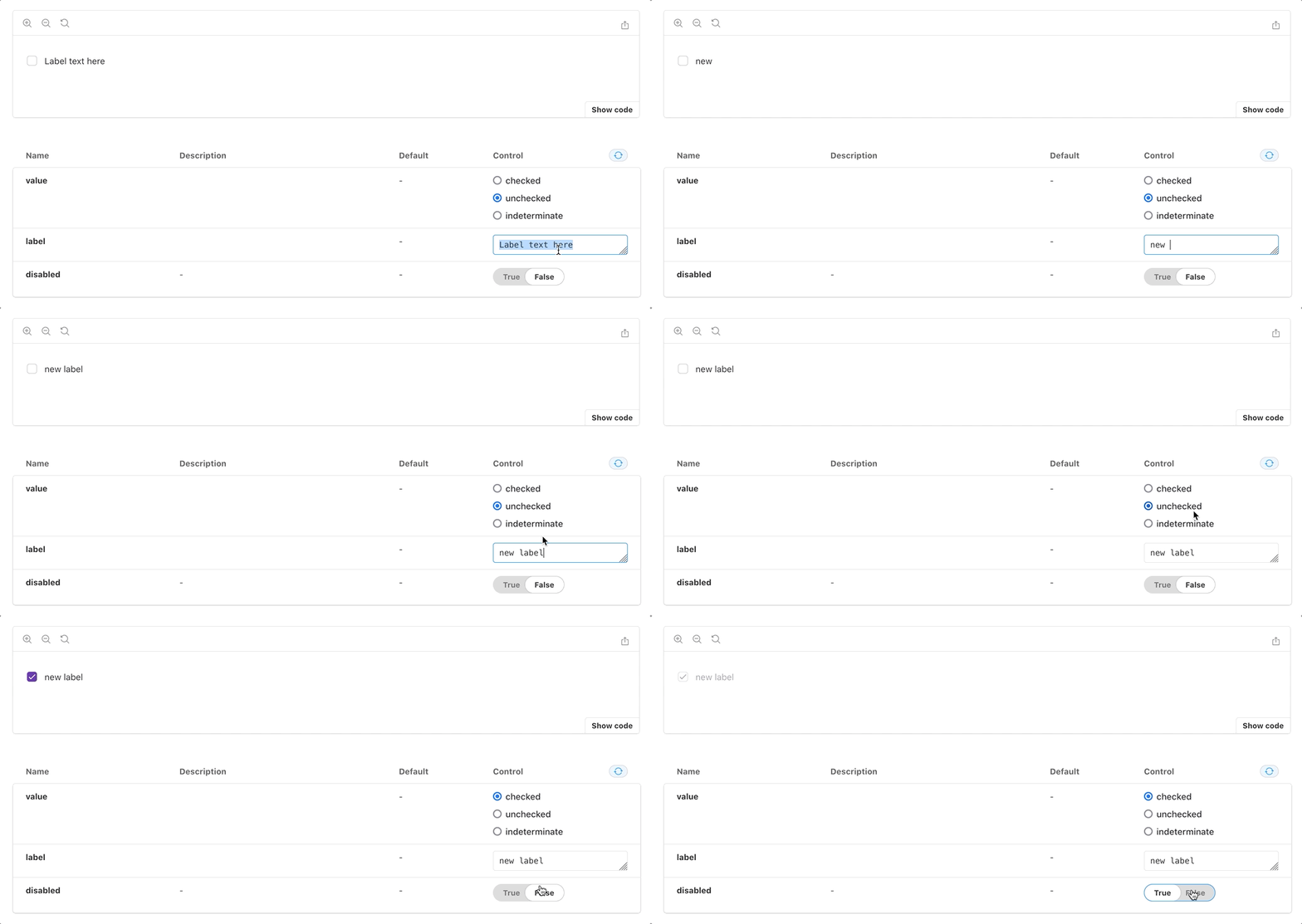
We use Chromatic to host our Storybook, so it is easily accessible to both engineers and designers.
Documentation. Along with the stories themselves, the Storybook entry for each component includes documentation about when and how to use the component.
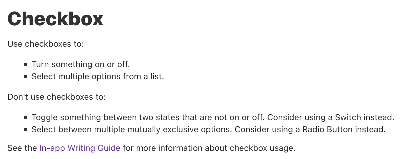
We also use a Storybook addon to link to the relevant component in our UI kit in Figma.
Test coverage. Since these components are the building blocks of our app, we have stringent test coverage requirements. All functionality must be exhaustively tested. We also use Chromatic for automated visual regression testing — any PR that causes a visual change to a story in our Storybook is automatically flagged for review.
Designer review. Components being added to the component library are reviewed by a designer to make sure everything looks just right. We use GitHub’s code review assigner to pick a designer, and then the designer uses Chromatic to review any visual changes and changes to documentation.
Building out v1
Once we had a shortlist of components and contribution guidelines, we started adding components to the library. We wanted to start with a component that was complex enough that we could use it to fine-tune our guidelines about stories and testing, and then let it serve as an example for engineers adding subsequent components. We chose Button, since it has multiple variants, each with several possible states.

The basic process of migrating a component is moving the code, improving test coverage, writing Storybook stories (or updating existing ones), and writing documentation. Right away we ran into a problem.
Our Buttons optionally render tooltips on hover, and it turned out the component was written in a way that depended on our Tooltip component. Since isolation is a requirement of the library, we’d either have to rewrite Button or move Tooltip first.
We didn’t want to hold up the entire component library project while we worked on Button, so we decided to switch gears and choose a different first component instead. With our original goal of “complex enough” in mind and now knowing what pitfalls to avoid, we landed on a much simpler component: RadioButton.
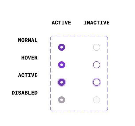
RadioButton still had enough states that the Storybook entry could serve as a meaningful example, but unlike Button it didn’t have any major dependencies on other parts of the app. Plus, RadioButton already had comprehensive tests and stories. We moved the code, updated the stories, and wrote the documentation, then went through code review and design review.
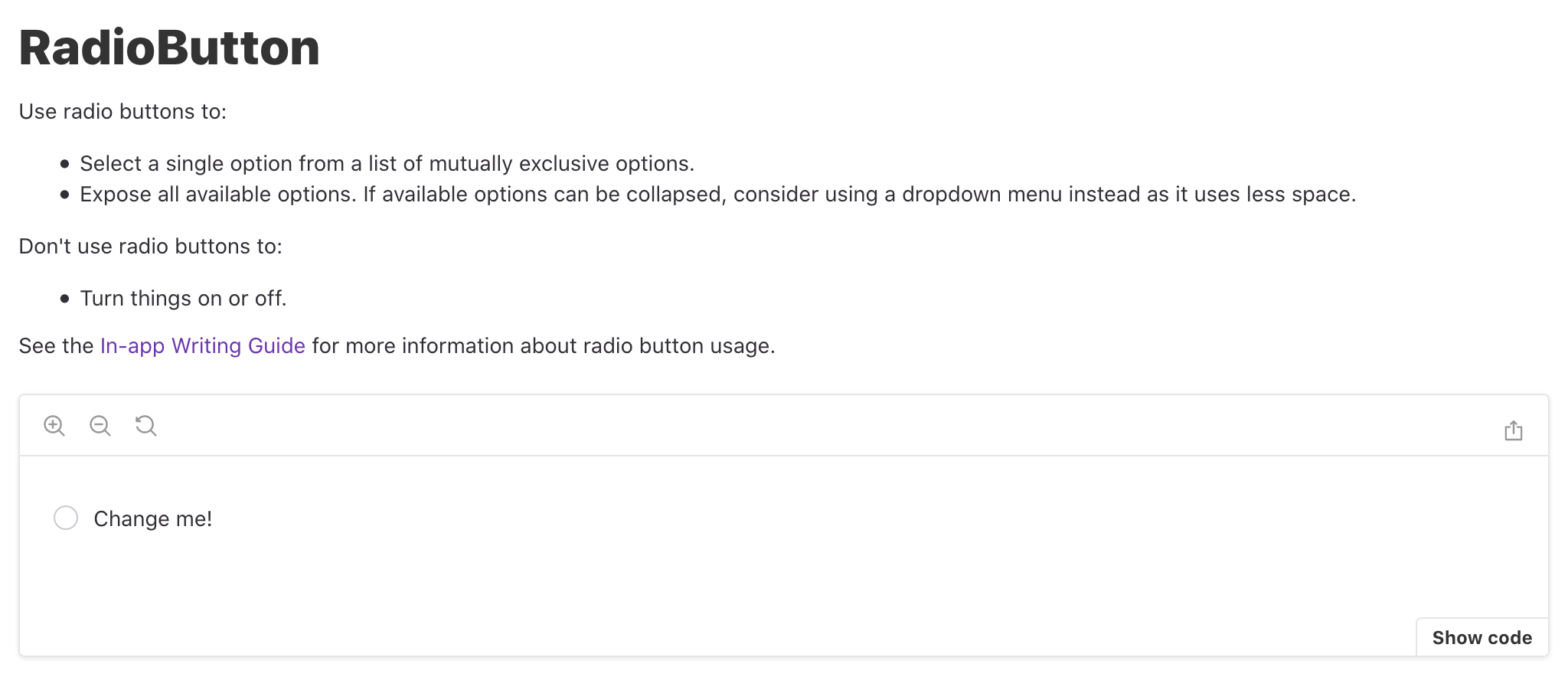
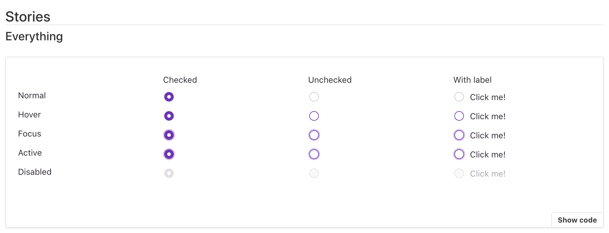
With RadioButton migrated, our component library was up and running. We then moved on to the other components on our shortlist, including returning to Button.
Getting buy-in
Making a component library is one thing, but making it part of how we work is another, and that requires getting buy-in.
The component library project was led by one of the three engineering teams that work on our front end. To make the project successful, we needed buy-in from the other two teams. Here’s how we got it:
Input on contribution guidelines. To get the other engineering teams involved right from the start, we asked for their reviews on drafts of the contribution guidelines as they were being developed.
Cross-team code reviews. Most PRs at Heap are reviewed by someone on the same team as the PR author. For the component library, code reviews are handled by a round-robin of engineers from every team that does a significant amount of front-end work. That means we spread component library knowledge across team lines.
Sharing the work. We chose a component for each team and asked them to take on the work of moving that component to the library. That process meant that each team had at least one engineer who had directly interacted with the component library and was familiar with the process of contributing code to it.
#design-system. We created a dedicated slack channel for engineers and designers to talk about all aspects of the design system, rather than having teams discuss individual components in their own internal team channels. This prevents siloing information about the design system.
Where are we now?
We now have all the components we chose for the first round live in the component library. We have a Storybook for the component library that is hosted on Chromatic where our designers can easily access it. We’ve also started work on refactoring a couple components that we deemed too unwieldy to be moved to the design system in their prior state.
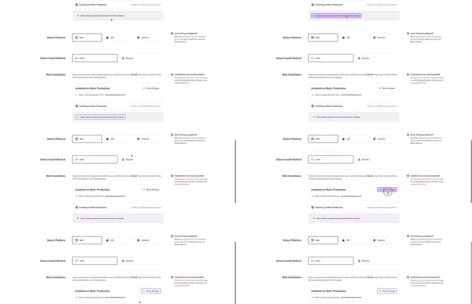
We’re not planning on a dedicated project to move more components to the library. Instead, as part of planning every project, we identify new components that should be added and existing ones that should be migrated as part of the project. For example, I recently added a new expand/collapse button while working on a feature to collapse the query builder section on reports in Heap.
Thanks to that new component, we no longer have two completely separate ways of showing and hiding information on a single page!
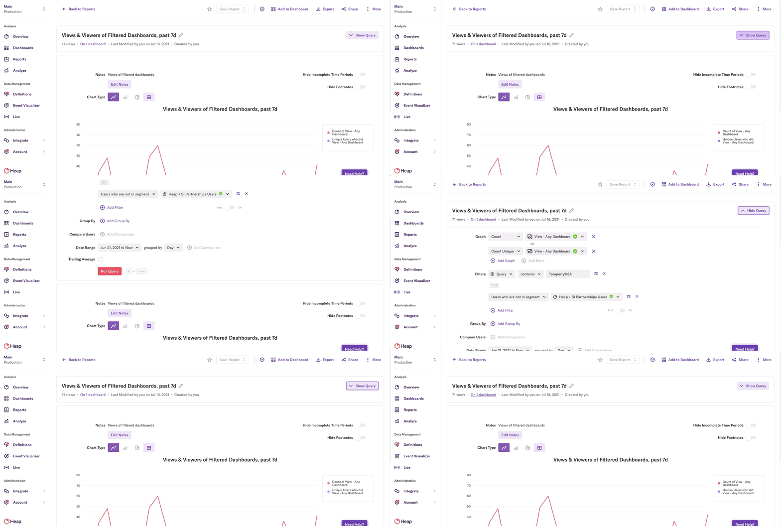
BEFORE
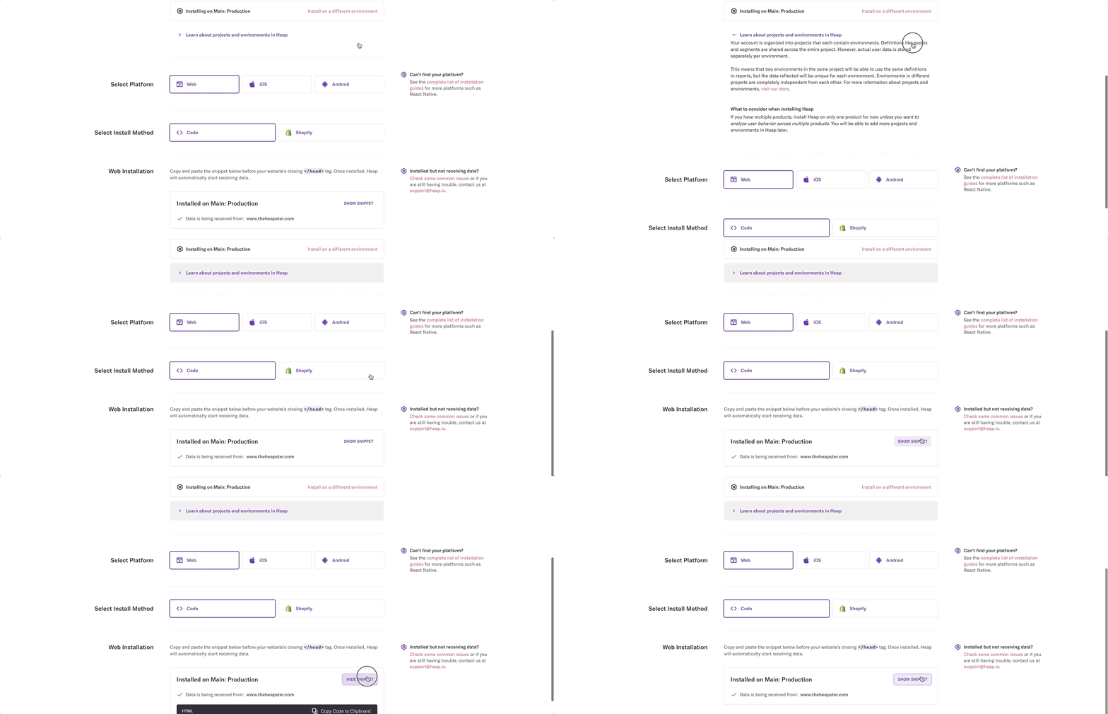
AFTER
Thinking about building out a component library, or worked on one before and have thoughts? Reach out on Twitter! And if you’d like to work on the design system behind the analytics app that helps thousands of companies make smarter decisions, we’re hiring.

