Data-Driven
How to use qualitative tools to overcome a lack of data
As a digital builder, you know the feeling of excitement when you're about to release a brand-new product into the world. But here's the thing: as much as you want to start optimizing right after launch, you often encounter a frustrating hurdle: the lack of substantial data.
It takes time to collect enough data to draw meaningful conclusions about user behavior. But let's be honest, who has weeks or months to wait around before taking action? You want to start optimizing immediately. That's where qualitative tools like heatmaps and session replay come to the rescue!
In this post, we'll explore how heatmaps and session replay enable you to draw early insights, test hypotheses, and iterate in an informed manner. Ready to unlock the secrets of optimizing your product with limited data? Let's dive in!
How to assess the early impact of a new feature using qualitative tools: three steps
Qualitative tools allow you to delve into user behavior trends from the get-go. By visually representing user interactions, they provide an intuitive way to understand how users engage with your product.
Step 1: Track usage metrics
To provide context for your qualitative research into early patterns and trends, it is crucial to establish baseline metrics. Despite being in the early stages of the product launch, monitoring key usage indicators can still offer valuable insights into the initial impact of the new feature.
Start by tracking:
Awareness: the number of users who have seen the feature
Adoption: the number of users who have used the feature
By keeping an eye on these metrics, you can begin to comprehend the initial response and engagement levels. These baseline metrics will serve as important reference points while examining the findings from your quantitative exploration. Remember, even small data points can provide valuable directional information.
Learn more about qualitative vs. quantitative data and how SaaS teams can use both.
Step 2: Dive into the user experience
Now that you have your metrics, it's time to take a closer look at the user experience using tools like heatmaps and session replay. As you immerse yourself in this qualitative data, it's important to observe and take notes. Look for patterns and generalizations from the anecdotes provided by heatmaps and session replays.
Unveil hidden patterns with heatmaps

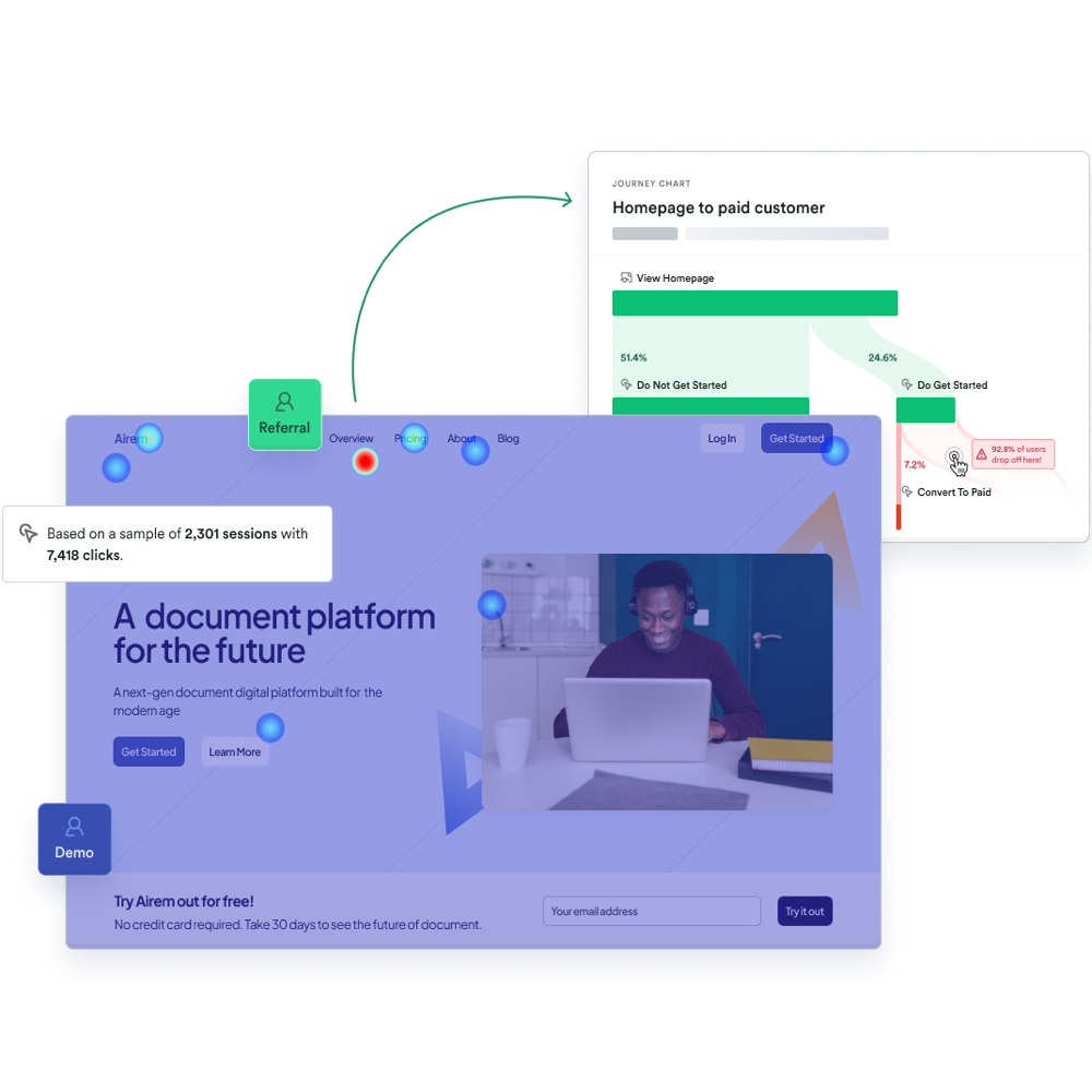
Heatmaps offer a visual representation of user interactions. They reveal what users see, miss, and how they engage with your feature. By analyzing heatmaps, you can gain insights into how users navigate your interface, which elements capture their attention, and where potential bottlenecks or usability issues may arise.
Start by building a heatmap for your feature. Identify spots of high interaction and zones that may be overlooked.
Look over your users’ shoulders with session replays

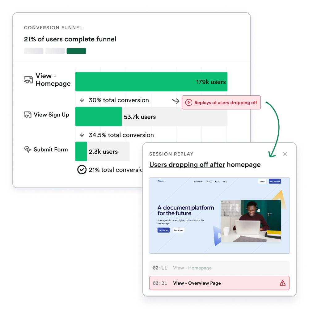
Once you've explored the heatmap, it's time to grab some popcorn and cue up the session replays. With session replays, you can witness firsthand how users navigate through your interface, interact with various elements, and respond to different features. While you don't need to watch entire sessions, focusing on key interactions can provide meaningful insights.
Aim to watch 10 to 20 replays of each interaction you’re interested in. Take note of moments of hesitation, confusion, or frustration. But pay equal attention to instances where users effortlessly navigate through the feature. These observations will help guide your decision-making process.
Some ideas for what trends you should look for in your heatmaps and replays:
Context. What were users doing before they used your feature? What about after?
Look and feel. How would you describe how they navigated around the feature? Confident, hesitant?
Surprises. What did they do that surprised you?
How did it look in the wild? Seeing a new feature in production can be very different! How did it look? Any unexpected or pleasing views to screenshot? How did it look on different browsers or devices?
Assumption checking. What assumptions or hypotheses did you have about this feature before it shipped? Are you seeing those play out in these individual replays?
Step 3: Take your qualitative analysis to the next level!
Unlock even deeper insights by tailoring heatmaps and session replays to specific key segments or audiences. Explore how new and power users interact, as well as your target audience's usage patterns.
Consider these questions to guide your analysis:
How do trends for new users compare to power users? What are the most common things new users overlook or misunderstand?
Are there any variations in user behavior or preferences based on the unique needs and goals of different target personas?
Do any segments exhibit unique patterns or preferences in their interaction with the feature?
Would any segments benefit from tailored experiences or additional support?
Step 4: Share findings & take action
With your insights in hand, it's time to share your findings and take action. Provide key stakeholders with an overview of how the feature is performing and the early user behavior trends you've identified. Share any successes, challenges, and potential areas for improvement.
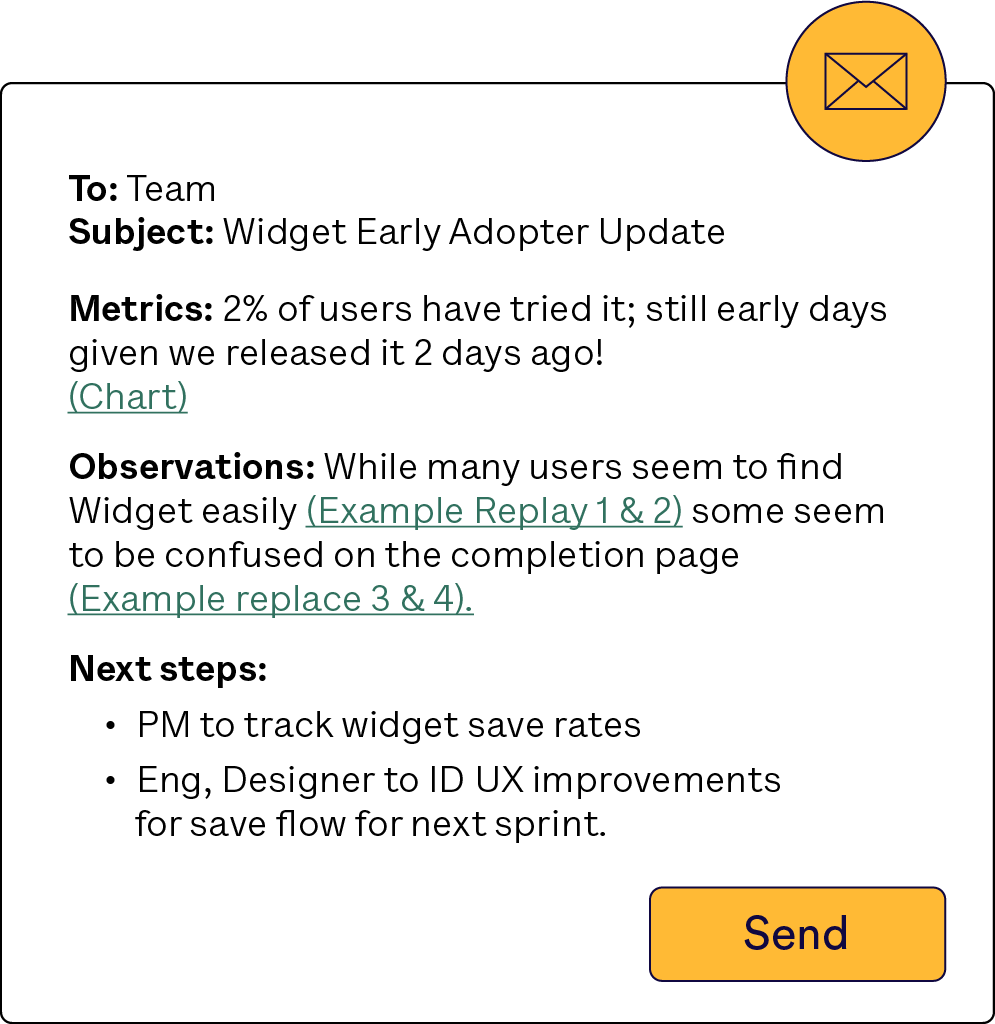
When sharing your early findings, frame them as an "early adopter" or "field" report. Integrate both early metric results and qualitative learnings, and include direct links to relevant heatmaps and replays. Look for correlations between your observations and the early metrics you've tracked.
Here’s an example of what this could look like:

Collaborate with your team to strategize on how to iterate, optimize, and refine the feature based on the insights gained. Remember, these early findings are the foundation for ongoing improvement. They provide a solid starting point for testing and iterating to enhance the user experience.
—
In today's fast-paced world, waiting for data isn't always a viable option. Fortunately, qualitative tools are here to save the day. Draw early insights, test hypotheses, and iterate in an informed manner.

