Data-Exploring
Building a Retention Strategy, Part 5: How to Create Operating Metrics for Scaled Customer Success
If you’re concerned about developing an effective retention strategy, this series is for you. In this and future posts, we’ll walk through the key ways to use data to make sure you’re building a smart, scalable retention motion. Most will also include worksheets you can download and use with your team.
In Part 1, we showed you how to establish Active Usage Metrics for your product.
In Part 2, we showed you how to connect these metrics to your ultimate goal—revenue—by designing a metrics tree, which maps out your whole product.
In Part 3, we showed you how to test the strength of your ideas with an Impact Calculator, so you can compare the value of different initiatives you’re considering.
In Part 4, we showed you how to use your metrics to create a dashboard, then use this information to figure out which accounts need immediate help.
Scaled Customer Success is all about creating a one-to-many motion that provides guidance and personalization to a large segment of customers, without lots of hand-holding. (This most frequently applies to smaller accounts, but not always.) A successful Scaled CS motion involves strategically-designed emails, in-app guides, community posts, and similar automated interventions. Even though these don’t involve a Customer Success Manager reaching out, it feels like information designed for that customer, calibrated to where they are in their customer journey.
If you want to be data-informed in your Scaled CS motions, you first need to set up the right metrics to track. This post will show you how to do that.
Your key metric = sustained use of your product.
Of all the many things you could measure, the most crucial is product usage: How well did your Scaled programs influence your users to adopt the product? At every SaaS company, the golden road to retention is product adoption. This is the metric that matters to the success of your business, therefore it’s the needle you should try to move.
To create a powerful usage metric, you first need to figure out the most basic action the user is doing in your product to get value. In the case of Heap, this action is “viewing a chart.” Almost every use case involves doing this action, so it’s our most generalized way to see the user is getting value.
My team measures usage at the user level and at the account level:
“Week 0 Chart Rate”: Of all the users who click on our campaigns, what percentage of them view a chart within 1 week of clicking on the campaign? (i.e. Did we get them to immediately change their behavior?)
“Month 1 Chart Rate”: Of all the users who click on our campaigns, what percentage of them view a chart 1 month after clicking on the campaign? (i.e. How well did the behavior change stick longer-term?)
“Influence on low-WAU accounts”: Of all the accounts with less than 4 weekly active users (WAUs), at what percentage of accounts were we able to influence at least 1 user to view a chart? (We’re very interested in increasing usage at accounts with less than 4 WAUs because our data shows that 4 WAUs is an inflection point in likelihood to renew.)
These are the metrics that my team works to move each quarter, and on which my success is measured every quarter.
Staying laser-focused on lifting usage will change the way you design campaigns.
Because our goal is to make it easy for them to actually view a chart in the product, my team works hard to entice users to take action in the product in as few clicks as possible.
Most of the time, we find it’s much more effective for our campaign CTAs (calls to action) to push users directly into the product UI and give them a walkthrough using Appcues, rather than having the CTA direct them to documentation or educational videos. Remember, we don’t just care that they clicked from the email or in-app guide; we care that they made it all the way to viewing a chart.
See how crucial it is to use the metric that will truly impact the business? Unfortunately, it’s much easier said than done. Most Scaled CS teams end up measuring less-important metrics. To avoid this sad fate, you need to steer clear of these 5 “gotchas”:
The 5 “gotchas” of Scaled CS
1. Only measuring campaign engagement
Most teams over-rotate on tracking campaign engagement: open and click rates. It’s tempting to track these, because they’re easy metrics to pull out of your email send platform (such as Marketo) or your digital adoption platform (such as Appcues).
Click rates and open rates are good directional metrics to help you see whether your message is resonating, whether your subject line is strong, and whether your campaign ideas are moving in the right direction. But they’re not enough – the bottom line is that a customer won’t stay with your product just because they’ve clicked on a nice email. A customer will retain when they’re consistently using the product.
2. Only tracking clicks on UTM codes
Many Scaled CS teams imitate what Demand Generation teams do – they embed UTM codes in their CTA links, and then they measure how many users made it to the targeted landing page containing those UTM codes. This is a very direct way to measure influence.
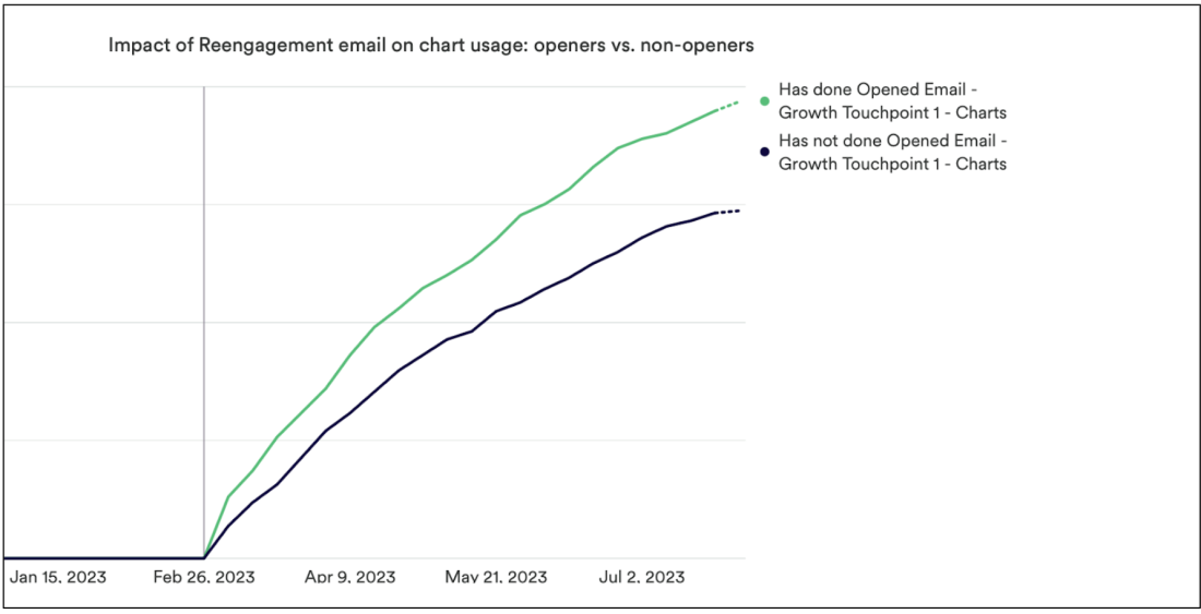
But that might not be the full story of your campaigns’ influence – as the chart below shows, we have found that our emails can influence users who never clicked or even opened the emails, especially in lapsed accounts. These users had all been completely inactive (0 chart views) for 90 days, and then when we sent them a reengagement email, the clickers were influenced the most to view charts, and then the openers were influenced the next-most, but users who only had the emails delivered still had a big lift in the chart view rate!
TLDR -- we’re influencing a lot of lapsed users to suddenly come back into the product right after they get the email, but clicks on UTM rates aren’t showing that full picture. I really recommend that you run similar analyses for your campaigns to see the influence of email deliveries or in-app guide appearances, even if the users do not engage with the campaign at all.

3. Just measuring adoption for individual product launches
Ah yes, product launches. Every PM thinks their launch is the best thing ever, and they want to have a separate campaign for it.
You will be tempted to only measure awareness or adoption of that one feature as your key metric of success that quarter. But remember, your goal is to increase overall usage, not just usage of that one feature. Your users already know you have a product! What they care about is reducing their own friction getting their jobs done. So your emphasis should be on adding more value, not on blasting every single feature release to every user.
4. Reporting your impact on the user level alone
We all know that we can only influence individual human beings to take specific actions (in this case, using your product). So you may be tempted to only report the way individual users have been influenced by your campaigns.
But the cold-blooded truth is that none of your executives care what individual users do. (Sorry.) They only care about account renewal rates.
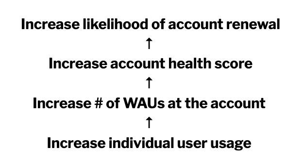
So when you’re reporting up, you need to show how increasing individual usage ladders up to account renewal, like this:

(If you don’t already have an account health score showing how usage and other factors correlate to account renewal, here’s how you can create one.)
Start by educating your executives about how individual usage leads to account renewal. Then they will respond well when you report to them about accounts where you were able to influence at least 1 user to take action.
Like this: “This campaign influenced at least 1 user in 10% of our accounts to be active in the tool this 4 weeks in a row, which increases these accounts’ likelihood to renew by 3%.” Or, “We found that low-WAU accounts that had at least 1 user receive this email have a 1.3-point increase in account health score, compared to accounts that did not receive this email.”
Now you’re proving that your campaigns are directly impacting renewal rate, and therefore directly impacting revenue. That’s what executives care about.
5. Only measuring accounts up for renewal this quarter
Your execs will likely ask for a report on how you’ve impacted accounts that are up for renewal this quarter. That’s fine, you can create a report filter to give them that information. But that’s not the full picture!
If you’re truly an account retention maven, you should educate your execs that the final quarter of the contract is generally too late to significantly sway the account’s usage. You need to be increasing usage rates early and often in each account’s lifecycle. Therefore, you should show stats on how you’re influencing every account’s likelihood of renewal, at every stage in their lifecycle.
Conclusion
Declaring product usage as your key metric will help you prioritize the highest-ROI initiatives. I hope that these 5 tips will help you evolve your team to stay focused and truly move the needle on customer retention.
Getting started is easy
Start today and elevate your analytics from reactive reporting to proactive insights. What are you waiting for?

