Data-Driven
Building a Retention Strategy, Part 4: How to prioritize your book of business engagements and interventions
If you’re concerned about developing an effective retention strategy, this series is for you. In this and future posts, we’ll walk through the key ways to use data to make sure you’re building a smart, scalable retention motion. Most will also include worksheets you can download and use with your team.
In Part 1, we showed you how to establish Active Usage Metrics for the value of your product equate to value for your business.
In Part 2, we showed you how to connect these metrics to your ultimate goal—revenue—by designing a metrics tree, which maps out your whole product.
In Part 3, we showed you how to test the strength of your ideas with an Impact Calculator, so you can compare the value of different initiatives you’re considering.
Today, we’ll discuss ways to apply your collections and calculations to your accounts. We’ll show you how to create a dashboard and use this information to figure out who needs help.
The process involves aggregating the metrics from your metrics tree at the appropriate levels. Then we’ll give you suggestions for next steps, and show you how to activate them.
NOTE: This workpage is primarily directed towards account directors and managers working in SaaS companies, as they are the leaders most frequently performing this type of analysis. If you’re not in SaaS, the general principles here may still be useful to you.
When you have a fully-managed book of business, it’s important to know where to direct your attention. So how do success managers and team leaders know which accounts are satisfied, and which accounts are starving for attention? You need a system that lets you discover:
Who needs help?
Who needs the most help?
How do we know what key danger moments are?
What are the next steps we should take?
How to get a birds-eye view into what’s really going on in your accounts:
At this point, you’ve defined your metrics. Now you need to source the data to calculate those metrics.
Step 1: Get all the data in one place
You’ll need to aggregate all the data in the same place so you can perform these calculations. This could be via a data warehouse like Snowflake, a BI tool sitting on top of a data warehouse, or even an independent BI tool.
Step 2: Discover your join keys
What Are Join Keys?
Join keys are fields or columns in a relational database that are used to establish a link between two tables. Combining data from multiple tables in a database query is a join operation, and the join keys are the columns used to match rows between the tables. They establish relationships between tables and enable retrieval of meaningful and consolidated information from multiple sources.
Why do join keys matter? Because the goal for you is to figure out how different metrics intersect. Your join keys are the points that signify where you’ll want to dive deeper into the information. Think about the top 3 to 5 metrics from your metrics tree that drive the success of your accounts.
For example:
Let’s say an acceptable result is when at least 55% of your accounts fulfill your chosen metrics.
That means there are two important questions to investigate:
Which accounts are >55%?
Which accounts are <55%?
If you want to be able to drill into those accounts, you’ll need to be able to discern which ones actually need help.
Step 3: Drill down through the hierarchy
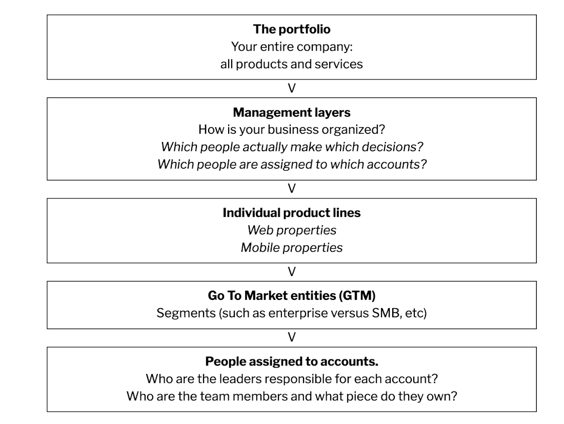
At the highest levels of the business, there are one or more management hierarchies. You need to build those management layers to have this drill-down capability in your dashboard.
The typical levels in a Sas organization are:

Let's say the metric you care about is monthly active users (MAU).
The threshold for healthy adoption is that you have 10 monthly active users, and half of your accounts meet that threshold….which means the other half don't.
Step 4: Build a strategy
To begin your strategy, the immediate question you want to answer is, “How many of those accounts are below threshold?” Then, it would be smart to look for trends that tell you which segment in the business, or which slice of the business is the healthiest, versus the least healthy. You want to become aware of which accounts to dedicate your time to.
Usually noisy accounts GET attention, but silent accounts NEED attention.
They say the squeaky wheel gets the grease, but the accounts that you don't hear from are the accounts that you're not even thinking about. These are the ones that will churn at a disproportionately higher rate—probably even higher than the noisy accounts will.
There’s a common sense to this, like we see with the 80/20 rule. But it's often difficult to identify exactly why accounts are unhealthy, let alone to create a scorecard. You may decide to add new KPIs that look at how well accounts are being managed:
When was the last time we talked to them?
Do they typically reach out to us, or vice versa?
Are they engaging with our customer help features?
Perhaps this wasn't even part of the original list of KPIs for your product, but this cockpit view tells you that it should be.
What the CSM scorecard looks like, organized by account:

A scorecard view of all the customers, side-by-side with your key metrics. Adding a red-yellow-green highlight relative to the threshold is a great idea as well.
What the Manager's scorecard looks like, organized by CSM:

As you develop this dashboard, you can bring in all of the customers' names. Then across the columns you’ll see your 5 to 10 most important metrics, with RYG highlighting so you can tell if they are moving in a positive direction or not.
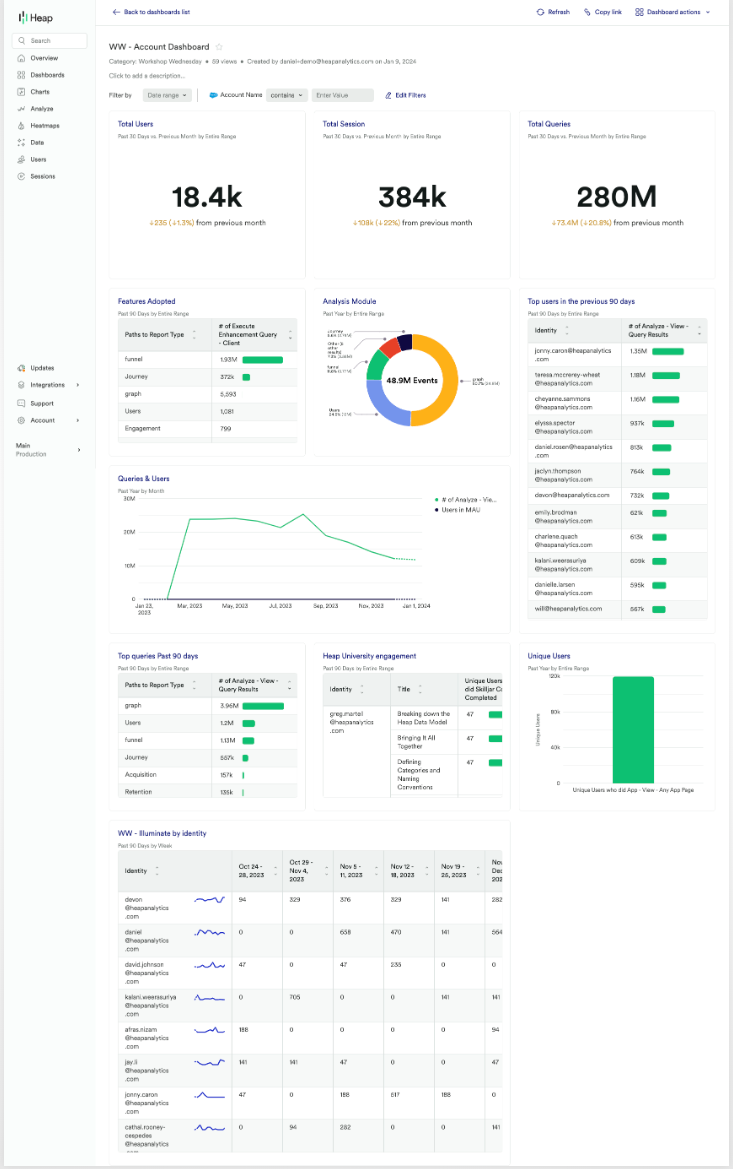
Here's what a full account health dashboard looks like in Heap:

Now you’re able to easily look each account up, down and sideways and notice, “OMG! This account has gone very red across all of these metrics.” Remedying that account’s status items becomes a high priority. Another account may be very green on some, but very red on others. And others might be mostly green and doing just fine. As an account manager, this will help you prioritize where to take first actions, and what those actions might be.
Can you see how setting up a dashboard like this would be hugely helpful to the success of your products, teams and entire business?
Getting started is easy
Start today and elevate your analytics from reactive reporting to proactive insights. What are you waiting for?
