Pseudo-R²: A Metric for Quantifying Interestingness
How do you quantify whether a statistical result is “interesting”?
One way that statisticians like to quantify interestingness is “variance explained” (a metric so popular I named my personal blog after it!) If you’re fitting a linear model, you can describe variance explained using the popular metric R² (also called the “coefficient of determination”).
But what if your outcome isn’t linear — what if you’re predicting “yes” or “no”? Can you still get a sense of the “variation explained” of a model?
In this post, I’ll share the details behind one of my favorite (and, in my opinion, underrated) statistical metrics, McFadden’s pseudo-R². As a motivating example, I’ll show how we use pseudo-R² to power our new Group Suggestions feature, by quantifying how interesting an insight will be before we decide to recommend it for analysis.
I’ll share how the metric is tied tightly to some other model evaluation metrics (especially log loss and binomial deviance), and why it’s my favorite of the bunch.
Example: Group Suggestions
Our motivation comes from one of Heap’s most used features, Funnels. A funnel calculates the percentage of users who start a flow (e.g. visiting a product page) that are able to convert (e.g. completing a purchase).
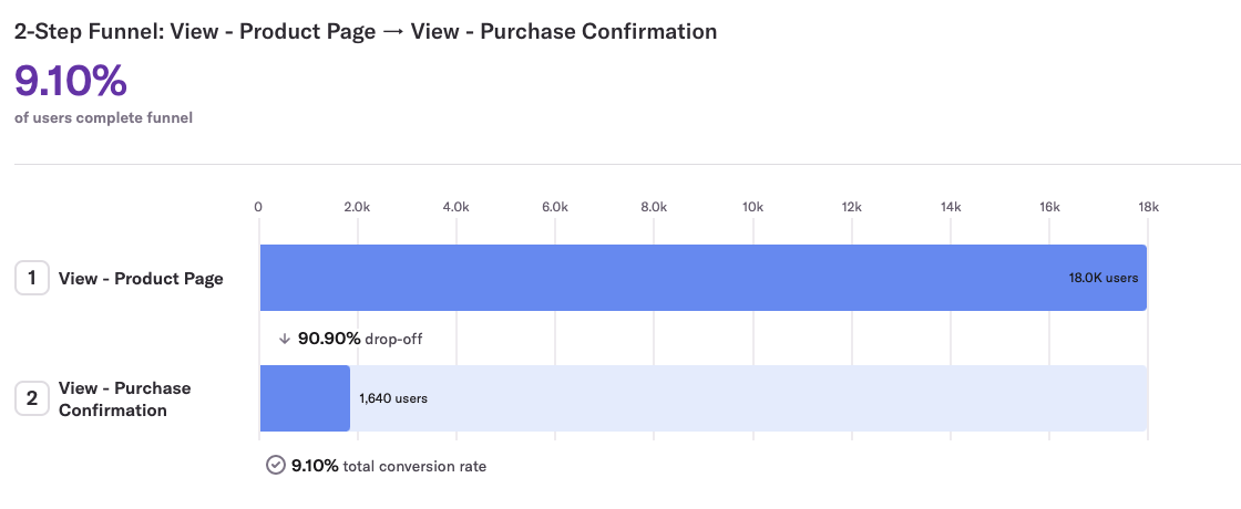
In this example, the funnel has an overall conversion rate of 9.1% (out of the 18K users who viewed a product page, 1,640 completed a purchase).
A key way that you can get more insight into a funnel is by grouping it: splitting the conversion rate by a property like country or landing page. In our new Group Suggestions feature (part of our Heap Illuminate suite of proactive insights), we automatically suggest interesting groupings. In this funnel, we’d recommend grouping by Device Type:
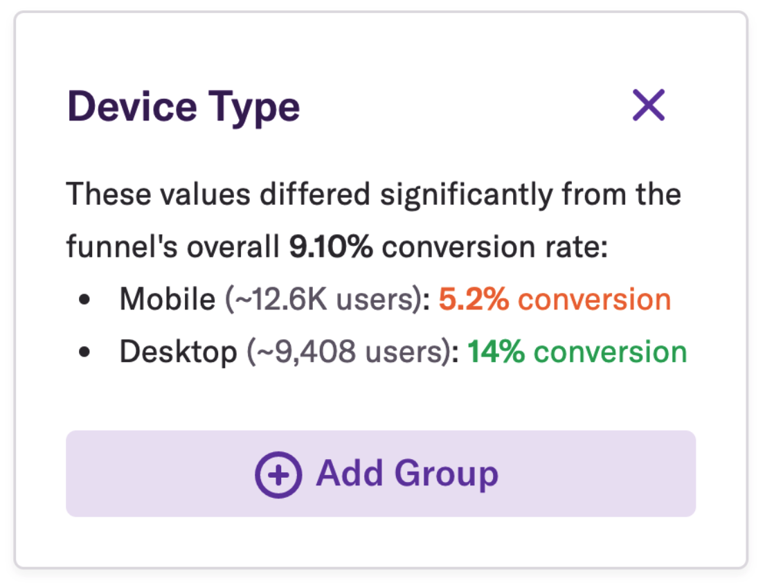
Notice that the conversion rate on Desktop is almost three times that of Mobile. As a product owner, that’s pretty interesting — I now know I should focus my effort on improving the Mobile conversion rate!
But how did we quantify that this grouping is interesting? How do we decide whether it’s worth showing relative to other potential suggestions?
On the Heap Data Science team, our job is to take our understanding of “this is the kind of result clients want to see” and codify them into metrics and algorithms that find “interestingness” at scale. In building this feature, we landed on pseudo-R2.
How do we calculate pseudo-R²?
Statisticians like to think in terms of a “generative model,” like a coin flip, die roll, or hand of cards, that assigns probabilities to outcomes. We can say something like “the probability of a fair die roll being 2 is 1/6.”
When we’re already looking at data, we can still talk about the probability that a model would have generated that outcome. Statisticians call such probabilities likelihoods: e.g. “that coin flip was heads, the likelihood of that was 50%” or “that 5-card hand is a 2 pair; the likelihood of that was 4.75%.”
Likelihoods are important tools in statistics and machine learning, and they’re essential for understanding pseudo-R².
(Note that the definition of likelihood sounds similar to a p-value, but is quite different. The likelihood is the probability a model would have generated some precise data; a p-value is the probability that a model would generate data that is at least as extreme, as judged by a test statistic. There are many interesting mathematical relationships between p-values and likelihoods, but that’s not for this post!)
Null model
The results from a funnel might look like this:

What generative model could explain this data? Well, there’s a simple model we could use: we could assume each user independently has the same chance of conversion, each 20%. We’re going to call this the “null model”. (ML practitioners would sometimes call it a “dummy” model, which… rude).
According to the null model, what’s the likelihood of these results — the probability we’d see each of these 1000 users succeed or fail the way they did?
200 users converted, and each of those users had a 20% likelihood of that outcome
800 users didn’t convert, and each of those users had a 100 - 20% = 80% likelihood of that outcome
Since the generative model assumes these likelihoods are independent, we can multiply all of them together:

That’s going to be a really small probability. In practice, we usually work with log-likelihoods rather than likelihood. With a little logarithmic fiddling, the equation turns into:

This means -500.4 is the log-likelihood of this data under this model.
It makes intuitive sense that we’d use 20% as the estimate for this model, but we also have a good mathematical reason. For this data, 20% is the maximum likelihood estimate: the absolute best we can do if we’re using just one number. Try putting in other values for the 20% and 80% in the likelihood formula above, and you won’t get a log-likelihood that’s any higher.
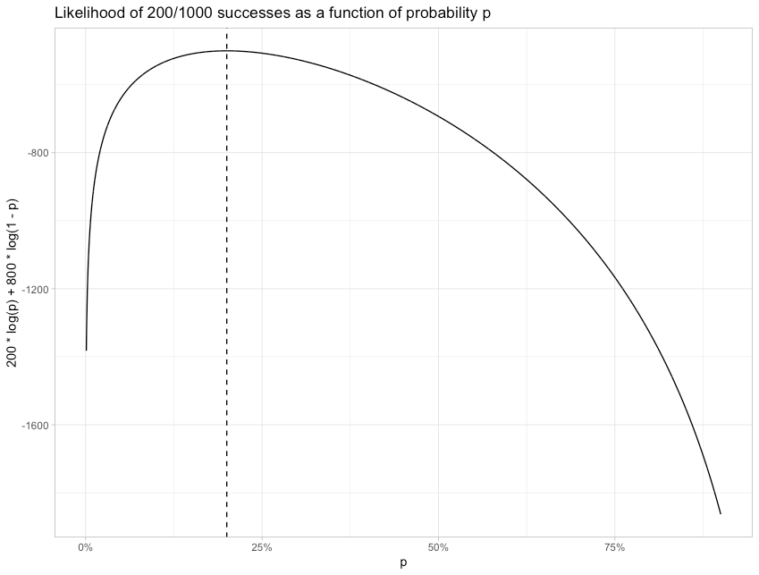
Still, speaking as a product analyst, the null model isn’t very exciting. We know that our conversion rate is around 20%, but we don’t have any hint as to why, or how we can improve it.
Alternative model: Group by Device Type
In practice, we have a lot of data about these users. What if we tried out a different model, where conversion depends on their Device Type (Mobile vs Desktop?)
We calculate a grouped funnel, where the results might look like:

This table could be describing the exact same data: 200 (150+50) conversions out of 1,000 (500+500) starts. But we’re applying a different model: in this one, a Desktop user converting would have a likelihood of 30%, and a Mobile user converting would have a likelihood of 10%.
(Note that while this data, and everything else we’ll explore, is based on two groups, the math extends naturally to 3, 4, or any number of groups.)
What’s the log-likelihood of this data under this new model?

The log-likelihood is greater (less negative) than the original -500.4, meaning this model is more likely to generate the same data.
So our model is better than a null model… but how much better? How are we supposed to interpret the difference between -500.4 and -468.0? Is -468.0 a “good” score? Where does it fall on a “boring to interesting” spectrum?
To answer that, let’s imagine how interesting the split could possibly be at explaining a 200/1000 conversion rate. It would look something like this:

Results like these would certainly be relevant from a product analytics perspective. If you saw these results, you’d have an immediate product action to take — you’d know something is terribly wrong in your Mobile funnel, and you should focus your attention there.
What likelihood does this correspond to?

The log-likelihood is 0, meaning the likelihood is 100%. This “most interesting” model will always generate this exact data. Put another way, this model explains all the variation in the data: there’s none left over. This means that a model’s likelihood lies along a spectrum from -500.4 (how likely the data would be under a null model) to 0 (a perfect predictor).
This brings us to our definition of pseudo-R²:

What that fraction is doing is converting this “boring to “interesting”- or “null to perfect”- spectrum to be from 0 to 1! Here’s how that looks on the three funnels we’ve discussed so far:

Pseudo-R² marks the progress between the null model and the perfect model. -468 is 6.4% of the way between -500.4 and 0, so the pseudo-R² of that model is 6.4%.
6.4% may not sound like a lot, but that’s because we’re considering how far it gets towards a perfect model. Put on another scale, a change from -500.4 to -468 means that the model is e500.4−468≈1014times more likely to produce this exact data than the null model was.
Pseudo-R² balances variation with composition
Why do I find this a useful metric for quantifying the interestingness of a grouping? Because it captures two factors that match our intuition about whether a grouping is interesting. First, pseudo-R² is low when the conversion rates across the groups are similar.

If the conversion rates in Desktop and Mobile are barely any distance apart, like 19% vs. 21%, the log-likelihood is hardly any better than the null, and the pseudo-R² is very close to zero. This captures our intuition: it doesn’t look like there are major problems in Mobile that are separate from Desktop.
For two groups of equal size, we can explore visually how the difference in conversion rates affects pseudo-R²:
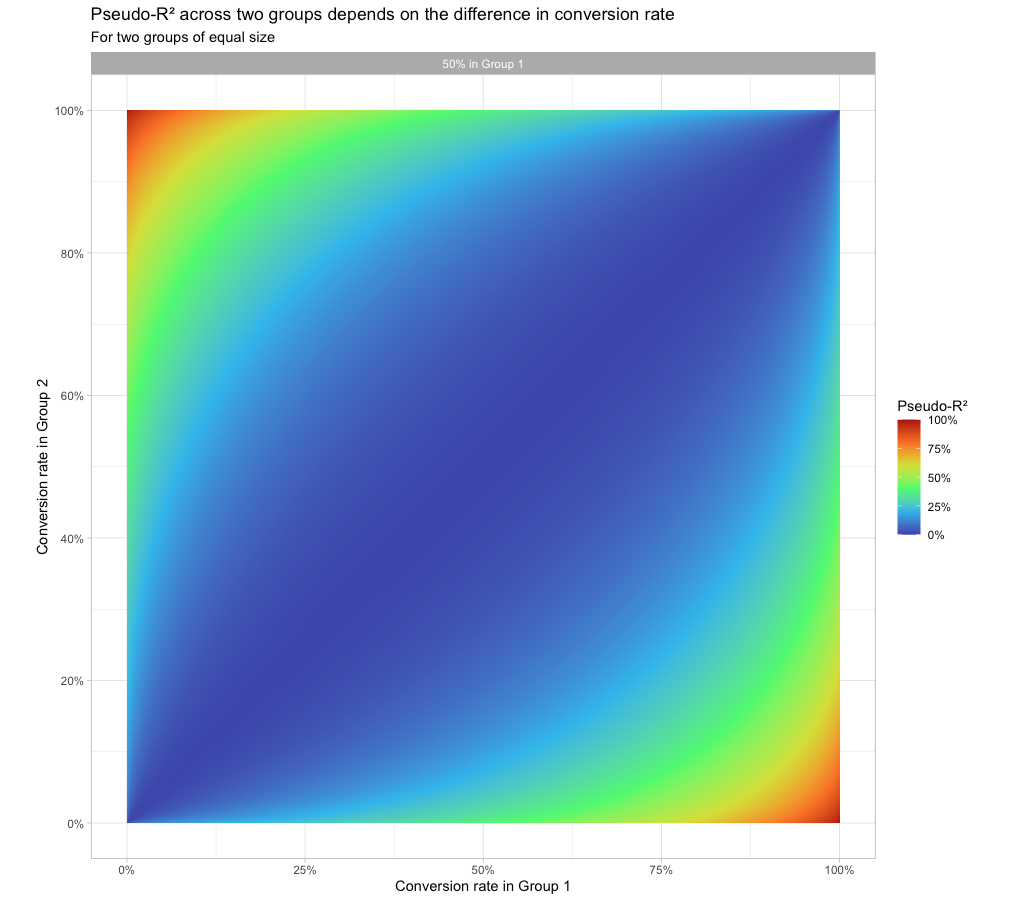
The diagonal, where the conversion rates are equal across the two groups, has a pseudo-R2 close to 0 (the groups explain none of the variation). The closer we get to the top-left corner (0% conversion in Group 1, 100% in Group 2) or the bottom-right corner (100% conversion in Group 2, 0% in Group 1) the closer pseudo-R2 gets to 1.
But that isn’t the only intuition we capture. Pseudo-R² is also lower when one group is far more common than the other.

In this case, the conversion rate does have a large difference: it’s 0% on Mobile! But barely any users are in that group. Even if we focused our effort on those users, there just isn’t much improvement to be had.
We can combine all five of these models into a spectrum so we can see how pseudo-R² works on them.
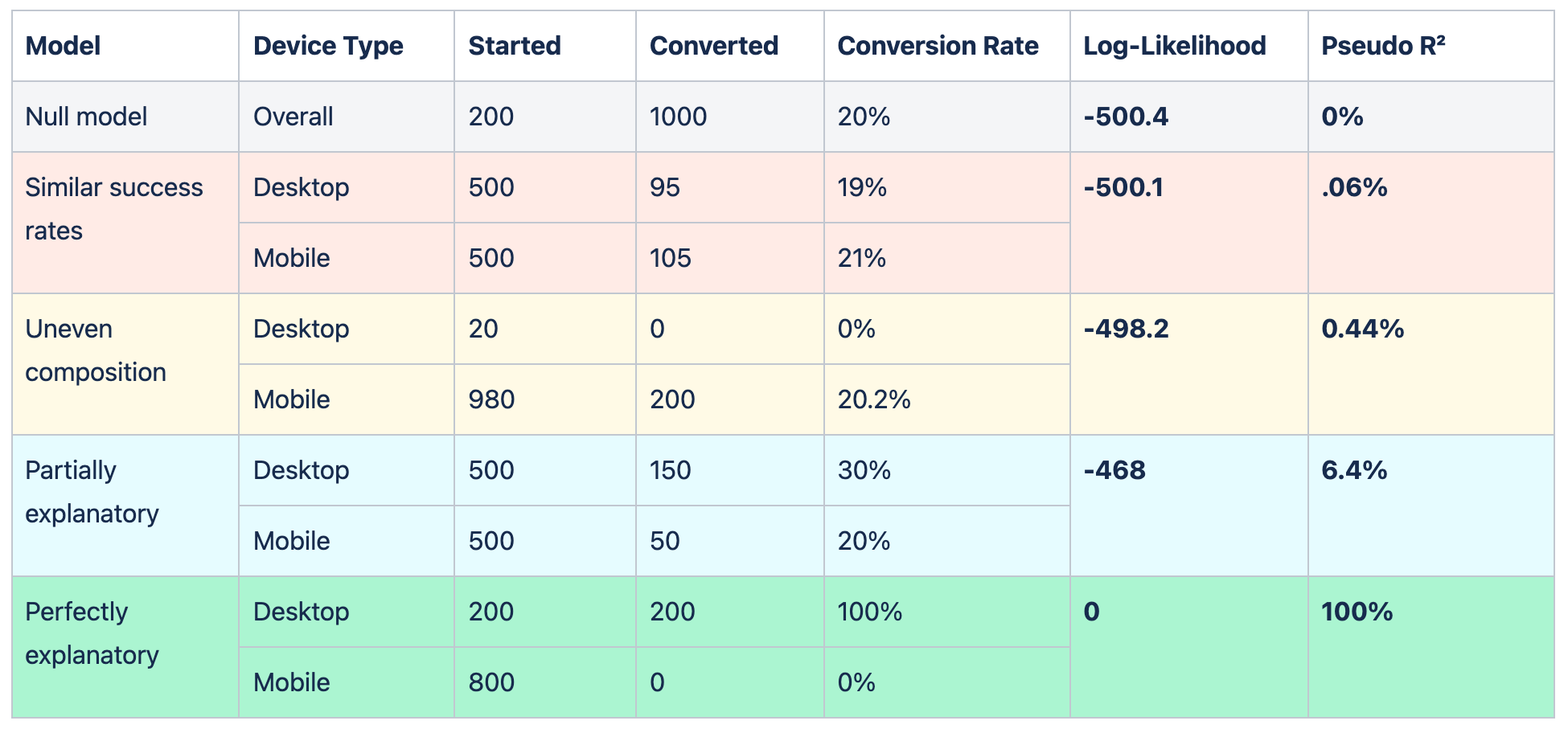
Pseudo-R² thus balances the variation in groups with the composition: it rewards groupings where there are common categories that have unusually high or low success rates. We can explore this visually as well:
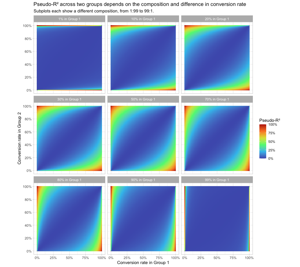
The closer the group composition is to 50:50 (the center panel, the same figure we’d seen above), the easier it is for the model to have a moderate or high pseudo-R². But when the composition is close to 1:99 or 99:1, then the difference in conversion rates has to be extreme to get a pseudo-R2 that’s not close to 0.
Pseudo-R² handles more complex models, such as 3+ groups
All our previous examples have been of two groups. But since pseudo-R2 is based just on the log-likelihood of seeing this data under this model, it scales elegantly to handle any number of groups. The metric weighs each group based on both its size and how different its conversion is from the overall rate.
For example, suppose device type were separated into three groups: Desktop, Mobile, and Tablet.

In this case, the two large groups of Device and Mobile both had a very similar conversion rate, and while the rare third group of Tablet had a considerably higher conversion rate, the model still ended up with a fairly low pseudo-R2.
With a few additional statistical tweaks (including some regularization to prevent the model from overfitting on a large number of groups), this metric can compare a diverse range of groupings — device type, country, referrer, etc. — and surface the one most likely to be interesting.
How does this compare to other model evaluation metrics?
We already have a lot of metrics we can use to evaluate machine learning models. How does pseudo-R² compare? I’ll answer in the form of a stats joke:
A model that maximizes pseudo-R², a model that minimizes cross-entropy, a model that minimizes log-loss, and a model that minimizes binomial deviance walk into a bar.
The bartender asks, “drinking alone tonight?”
That’s right — these are basically four identical ways to describe the act of maximizing the log-likelihood.
The key difference between the metrics is that in pseudo-R², we’re normalizing to be between 0 and 1.

That denominator doesn’t appear in other metrics like log-loss; it’s where we normalize by the log-likelihood of the null model. It’s a small tweak, but one that I like a lot, because it means you can compare between two models in a way that you can’t with some other model evaluation metrics.
We can consistently say that a model with a pseudo-R² of 5% is more interesting than a model with a pseudo-R2 of 1%, even if they’re on completely different datasets.
Conclusion: Why I still like playing the classics
My favorite thing about my job is that I’m working to productize myself. In my previous roles, I helped discover insights about one product at a time. But at Heap I’m building features that help thousands of companies find insights about their own products.
This is exciting, but it also means we face a really interesting set of constraints!
The interpretation is the product.
Interpretability is an important part of many machine learning approaches, but usually a machine learning model is ultimately judged by the prediction (e.g. “does this image have a bird in it?”). In our case we’re not delivering a prediction — the model interpretation is what we’re delivering to users!
Our team has to codify our own intuition about what is interesting.
Data scientists can usually “follow our nose” when we’re looking for meaningful and actionable insights, but that’s not an option with automated solutions.
Our solutions have to be robust across many use cases.
We won’t be there to customize or tune the approach, or to catch edge cases.
I like these constraints because they take me back to my roots in statistics. A lot of classical statistical methods aren’t “flashy” but are interpretable, intuitive, and robust. I hadn’t used pseudo-R2 since grad school, but it turned out to be a great fit for this problem.
Group Suggestions was the first feature I helped build during my work at Heap (as part of Heap’s Ship Week in July 2020, I partnered with two engineers to get it into production in 5 days — which is a story in itself!) And I’m excited to continue releasing statistically-driven features and sharing the statistical methods behind them.
If you like talking statistics and product analytics, @-me on Twitter @drob. And if you’d like to use statistical approaches like this to build the next generation of product analytics, we’re hiring! Check out our team and open roles.

