Getting the Details Right in an Interactive Line Graph
At Heap, we recently redesigned our line graphs with an eye towards user experience and data transparency. Line graphs are simple and well-known, and many of the changes we made may seem small or inconsequential. However, the net effect is quite dramatic, which you can see for yourself by interacting with the live graphs below.
Heap is web and iOS analytics tool that captures every user interaction and lets you analyze it later. This means that, when you want to answer a question with data, you can do it immediately, instead of writing code, deploying it, and waiting for metrics to trickle in over the span of weeks.
Heap’s Old Line Graph
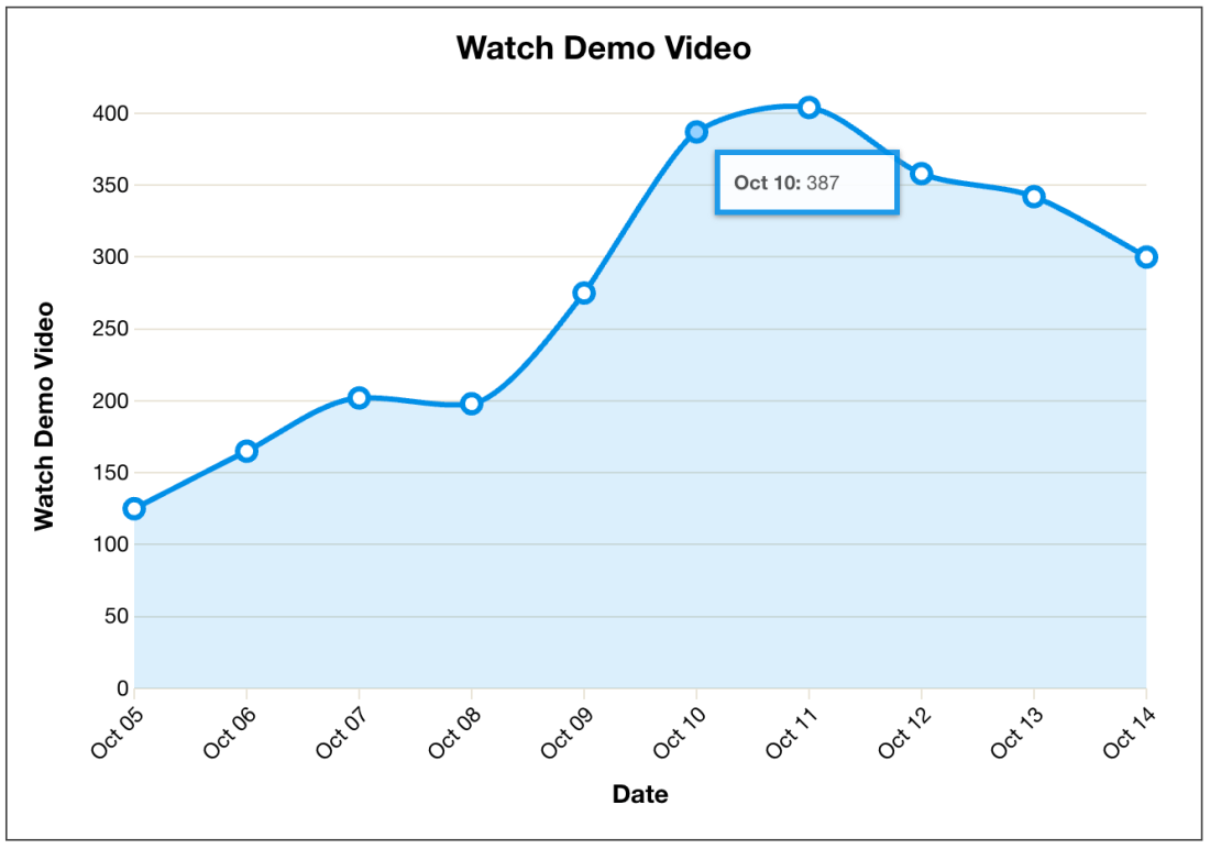
Below is the old version of our interactive line graph:

This is a usable line graph, and many of the design decisions we made seemed reasonable.
Hover targets. The chart allows users to mouse over the vertices (dots) in order to see a tooltip showing the number value of the data point.
Interpolation. We made a decision to use monotone cubic interpolation to draw the lines. This causes the lines to look “curved” or “smoothed” between points, instead of a jagged line that merely connects the dots. We did this for aesthetic reasons.
Animation. When hovering over different vertices, the tooltip has a 100ms transition animation to the new location. This helps the interaction feel more fluid.
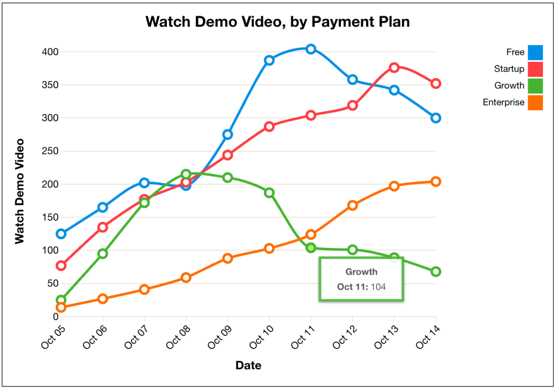
Let’s take a look at how this version of the graph fares with multiple series:

Aside from the addition of a legend, there are almost no changes here. A big problem was that we didn’t treat a multiple line graph as a different design problem than the single line graph, and it suffered as a result. We’ll see below how reconsidering this approach led to a lot of improvements.
The New Line Graph
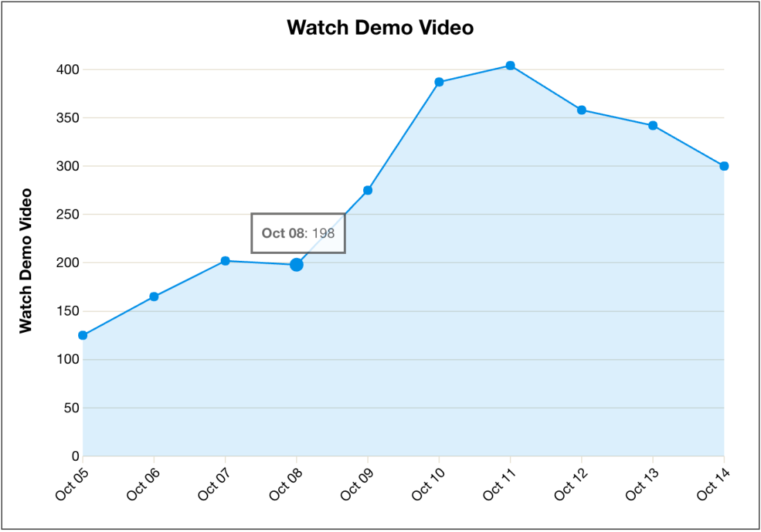
Customer feedback and our own usage of the line graph helped us uncover several problems. We addressed these problems with our new interactive line graph, shown below:

There are a number of improvements to the single line graph.
Target size. The old targets were far too small. A user needed to align their mouse exactly with a target with a 5 pixel radius. Both repeated use and Fitts’s Law told us that this was a suboptimal interaction. The new version of the line graph displays values in a tooltip when mousing over any part of the chart area. It uses the x-value of the mouse to determine which vertex to target.
Animation. We lowered the tooltip animation length to 50ms, to eliminate jerky, distracting animations caused by large animation times on the old line graph. We didn’t eliminate animations entirely, however, since they give an impression of continuity. The animation also uses linear easing instead of d3’s default “cubic-in-out” easing, which allows for smoother transitions especially when moving the mouse across between many data points.
Less clutter. We removed the x-axis “Date” label, since the x-axis on our line graphs was always a time series, and people can recognize that an axis with labels like “Jun 1” or “March 8 – March 15” refers to time periods. There’s no need to include a label “Date” which takes up vertical space and adds nothing to comprehensibility. However, we retained the y-axis label, since units change across graph types (pageviews, visits, events, etc).
Linear interpolation. We got rid of the monotone cubic smoothing/interpolation of the lines, since it’s potentially misleading. Instead the lines between vertices are now straight.
Mouseleave interaction. When the mouse leaves the chart area, the tooltip disappears. This was an oversight in our previous version of the line graph.
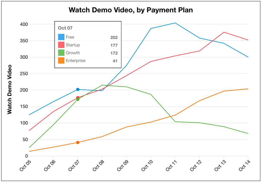
The multiple line graph is also improved, and many of these improvements are a result of thinking about the design of the multiple line graph specifically. Here’s how it works now:

Hover interaction. One of the biggest problems with the old version of the multiple line graph was overlapping vertices. It was often impossible to hover over a vertex that was being covered by another vertex. For the new graph, we had the legend turn into a tooltip with values when mousing over the graph. The entire legend/tooltip is given an opacity of 0.8, so that lines may still be seen below when it overlaps.
Eliminating vertices. For line graphs with a large number of data series or a large time range, the large vertex size of the old graph (5 pixel radius) caused problems. The size of the vertices remained the same while the total amount of vertices increased. This caused an increasing percentage of the lines in between vertices to be covered up by the vertices, obscuring our ability to spot trends and changes in data.
Performance. For multiple line graphs over long time ranges, the old line graph required us to render sometimes hundreds of SVG circles. Eliminating vertices greatly improved performance, and also enabled graphs that weren’t possible before (for example, graphing something hourly over a month-long time range).
Mouseleave interaction.When the mouse leaves the chart area, the tooltip reverts to the initial position of the legend.
Despite these improvements, there are a number of tradeoffs we made and questions that remain.
Number of data series. The multiple line graph is limited to 10 data series (if there are more than 10 in the returned data, only the 9 largest and “Other” are shown). How can we simultaneously display more time series without overwhelming our users?
Tooltip/legend. In the multiple line graph, the legend often obscures the data. This is addressed somewhat with the lowered opacity of the legend and the ability to move it around, but there are other possibilities:
One option is to move the legend to the side of the graph, and keep it fixed there (like it was in the old version of the line graph). We chose not to do this, since this takes up horizontal space. Also, when mousing over the chart, the displayed values might be on the other side of the screen, which is suboptimal.
Another option would be to display a table of values below the chart and eliminate the hover interaction entirely. This is similar to how we redesigned our funnel visualization (which may be the topic of a future article). However this is suboptimal since there is no visceral connection between the line graph and the table. They’re just two different views of the same data, rather than a unified single visualization.
Hit us up @heap with questions, thoughts, or links to well-designed line graphs you’ve seen elsewhere. Or just leave them in the discussion on Hacker News.If you find this kind of work interesting, we’re hiring! Check out our engineering team and open roles.
