5 eCommerce A/B Test Ideas to Try
How much of your marketing strategy is based on things you know instead of things you “think” you know?
Although there is more data than ever before, the reality is that it’s still hard to understand customer behavior. According to Forbes, 58% of e-commerce employees say they need better skills to leverage and analyze customer data. Fortunately, A/B testing enables e-commerce professionals to base decisions on real behavioral patterns rather than presumed knowledge about website visitors.
You may have heard stories of how effective A/B testing can bring in more sales, expand an email list, generate more leads, and improve customer retention rate. While there’s no guarantee you’d get a similar result, A/B or “split” testing is undoubtedly beneficial to your marketing, your online store, and your brand.
First a Primer: What Is A/B Testing?
The goal of A/B or split testing is to measure the performance of two slightly different varieties of the same webpage (or opt-in form or discount coupon). You have the existing version (the control) and the version you think could perform better (the variant).
For a specified period, you expose half of your site visitors to version A (control), and the other half to version B (variant). The version that results in more clicks, sales, subscriptions, or downloads wins. For example, let’s say version B (variant) of a discount code yielded the most redeems. You would then consider it the winner and expose 100% of your visitors to version B.
Additionally, the results of an A/B test can help you uncover essential insights. The value of these results is quite transferable. For instance, a “suggested items” insight from an A/B test performed on a product category could help inform your value proposition and other categories’ descriptions. Companies like Optimizely can help you get started with running experiments on your website.
Getting Started with A/B Testing
If you’re already into e-commerce analytics, you likely already have A/B testing preferences that could be holding you back. You might have a visual mindset, for example, and only focus your tests on elements like layout or images. Or you might think about the content of the home page or product pages. Or you could think in hierarchical terms and focus on elements like which navigation generates the most clicks.
While none of these are bad, these biases can prevent you from other A/B tests that are even more worthy of your attention. Eventually, those who test the same elements will get to a phase where they start to experience diminishing returns. The rewards of A/B tests become smaller and smaller, making it feel like A/B testing isn’t worth the effort. To gain traction, you need to try new things and look at data beyond just the winner of an A/B test, like revenue and conversion down funnel.
If your A/B tests begin to feel stale — especially in advance of the holiday season — have the courage to explore variations of drastically different elements than ones you’d normally test. Here are 5 A/B testing elements for inspiration.
A/B Test 1: Call Out Pricing or Deals on Category Images
Consumers are more inclined to explore category pages when there are exclusive deals available. Draw them in early by placing callouts on your category visuals, so they have an incentive to look further. Try using:
Colors that contrast from the main category image for the callout.
A/B test various callouts like “$10 or less” vs. “as low as $10.” Don’t forget to mention the name of the category before the callout to make it specific to a product range.

A/B Test 2: Offer Related Products Based on Specific Items
Product recommendations can significantly boost your store’s revenue. Best practices suggest that additional items go with each product intelligently below each product’s description, under the “frequently bought together” heading.
Rule of thumb: display products that serve as a great complement to the main item. In addition, the related products cost less than the item consumers have just added to their shopping cart. So if they’re about to buy a camera, it makes sense to recommend a camera bag or photography book.
A/B Test 3: Experiment with Visual Cues
Visual cues are one of those elements that seem great in theory, but don’t always have the best impact on conversions. You’ll come across plenty of stories praising their influence but you can’t just infuse colors and arrows and expect conversions to skyrocket.
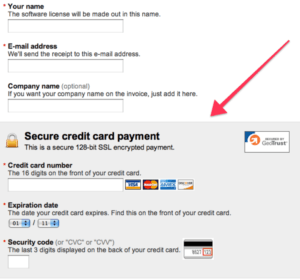
That said, what doesn’t work for one e-commerce store might work wonders for another, so don’t be afraid of A/B testing visual cues to see if they have a positive impact on your bottom line. This can be done in several ways. For instance, you can guide shoppers in the checkout process by highlighting where they need to enter their credit card details.

Similarly, you can use arrows that point toward the next action step visitors need to take to add an item to the shopping cart, sign up, or enter a promo code.
A/B Test 4 Social Logins
Requiring visitors to enter their names, emails, and other credentials can deter them from moving through the conversion funnel. In fact, you might drive them away to other websites that don’t too ask for too much data. For the uninitiated, social login offers a viable alternative to traditional registration procedures.
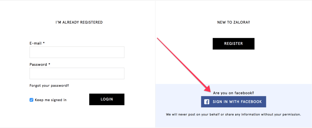
For those unfamiliar with it, social logins empower users to log in from social media platforms like Facebook and Twitter to register an account with e-commerce websites. Not only can it improve the customer experience on your website – no need to remember more usernames or fill out registration forms – it also enables you to collect more accurate data — including relationship status, age, interests, verified emails, and more.

Figure 3. Social logins can be a win-win experience — for users, it’s less work to move through the website. For you, it’s more accurate data about your customers.
You can split test social logins in several ways. For example, you could test between Facebook and LinkedIn logins (professionals might be more comfortable with signing in from their LinkedIn profiles) to see what brings in most registrations. In addition, you can A/B test country-specific social logins like WeChat if you’re targeting a particular regional audience.
A/B Test 5: Put Reviews Front and Center
Are your visitors aware of your store’s credibility? Increase the visibility of customer reviews and testimonials on product pages to see if transactions increase as well. People search reviews and value them as much as they value personal recommendations from friends and family. Hence, it’s a good idea to A/B test customer reviews for your online store.
Consider putting them directly under visuals or highlighting them with buttons and text styles that attract attention. Additionally, you can split test internal reviews by replacing with reviews from external websites on some items to see if that increases your sales revenue.
Final Verdict
With holidays being a high-traffic time for the e-commerce industry, you can’t afford to jump in on the action without putting together a solid A/B testing roadmap. Apply the split testing strategies mentioned above on different elements of your website to potentially improve your conversion rate.
E-commerce analytics tools can also help you automatically capture experimentation variation data and gain critical insights (impact on revenue for example), so you can identify ways to optimize product changes and find the digital channels with the highest return. Try Heap for free.
