Using Data to Simplify Your Product
Building new features is fun. There are few things more exciting than imagining the myriad possibilities of your product, and making those possibilities happen. But it’s often just as important to remove unneeded features. Here’s why.
Why remove a feature?
Even the simplest features have an ongoing cost. Let’s say your product allows customers to create graphs. One day, you decide to add a feature where customers can also download image representations of those graphs. A developer puts together the feature quickly by using a library that converts your SVG graphs to PNG image format.
But that’s not where the cost ends. Once the feature goes live, people are confused about what “Export as PNG” means, so you have to edit the text to read “Export as Image.” Also, it turns out the downloaded file is missing a file extension in Safari, so a minor fix has to go out there.
Then a few weeks later you upgrade the UI of the graph view and also have to figure out where to fit in the image export button. Finally, a few months later you change your graphing library so it’s no longer using SVG, and you need to find a new image conversion library that works with the new graph format. These small changes add up to a lot of distractions and wasted time for your development team.
Your product shouldn’t be a “bundle of stuff,” it should be a cohesive experience. You may have seen those tables comparing products, showing a bunch of checkmarks in the featured product’s column and few checkmarks for their competitors. These rarely work, since most product purchasing decisions aren’t a result of weighing Feature Set A vs Feature Set B. It’s much more about how well a product communicates its core value proposition, ease of use, etc.
This is why things like a solid onboarding process or good documentation can’t be advertised as features, but can improve customer satisfaction and retention. To that end, removing features can be a way of de-cluttering the UI and eliminating distractions.
So if we accept that sometimes features need to go, how do we determine that? Let’s take a look at how to use data to figure out whether a feature should stay or go.
Create a Hypothesis
You should have an intuition about why a feature should go before diving in. Simple high-level engagement metrics (e.g. percentage of users who are using a feature) are a good starting point, but you should also have good qualitative reasons for wanting to remove a feature.
In our product, we allow people to create line graphs that show how various metrics are trending over time. We used to have an checkbox option to display the graph as a cumulative graph. A few months ago, I had just spent a couple hours fixing a bug related to cumulative graphs. That was the third time we’d spent developer time maintaining this feature. This ongoing cost, plus my strong beliefs about the uselessness of cumulative graphs, led me to ask whether this was something we should remove.
Measure Engagement
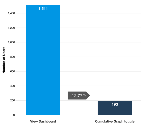
When evaluating the cumulative graph feature, we first looked at overall engagement. About 13% of all Heap users tried out the feature at least once, which is a pretty sizable portion:

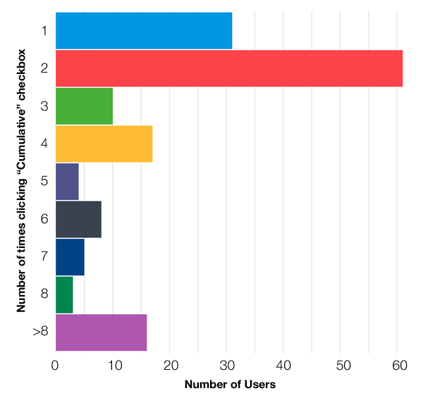
But that’s also somewhat expected. The cumulative graph checkbox was prominently displayed in our graphs, it made sense that a lot of folks would try it out at least once. So we asked a follow-up question: how many times were people using the feature? If someone used it once, did they deem it useful enough to keep coming back? Here’s a graph showing the number of times people clicked the cumulative graph checkbox:

Most people only used the cumulative graph feature once or twice. The spike at 2 (and smaller spikes at 4 and 6) makes sense, since a lot of people clicked the checkbox to see what would happen, and un-checked it right after. Usage is quite low: only 16 people used the feature more than 8 times.
Segmentation
We’ve established that the cumulative graph feature has low overall usage, and the people who do try it out don’t end up using it often. But there are a few frequent users of the feature, and we need to figure out whether this is delivering real value, or whether these are just random outliers.
If we can make a case that these users fall into an important customer segment, then it may be a useful feature, even if it has low overall usage. For example, Adobe Photoshop has thousands of niche features that rarely get used. But if a focused subset of Photoshop users like “aerial sports photographers” needs a specific feature, then it may be worth maintaining.
For the cumulative graph feature, we had few enough volume users that we were able to just look at those accounts individually. We generated a list of users who had used the cumulative graph feature at least 8 times in the prior week. It turned out that most of these customers were on our free plan. Also, their usage of the feature didn’t seem to be part of any their core Heap reports or other value-generating activities.
We considered reaching out to a few of these customers to get feedback, but we felt confident enough to remove the feature entirely. Since then, we haven’t received a single complaint or comment about the absence of the feature, or any customer churn that we could attribute to that change.
