It's Time to Get Real About User Behavior
We all know that funnels aren’t perfect. While your user flow diagram neatly funnels customers straight from step one to two to three, the reality is that users rarely walk a straight line through your digital experience.
Customer behavior skips around, goes sideways, and sometimes even backwards. Let’s face it: funnels are a poor tool for tracking user behavior as it actually happens.
In fact, 84% of all funnels deliver incorrect or misguided information, leading to misguided goals and incorrect assumptions. So odds are, you’re building your digital experience based on bad data. (Download the second installment of our groundbreaking Digital Experience Insights Report to learn more!)
This is gonna hurt, but it’s time somebody said it: what you can’t see about user behavior is ruining your business. If your analytics tool isn’t taking the complexity of all your users’ journeys into account, then your insights are ultimately unreliable. By relying on an incomplete, inaccurate, or misleading view of user behavior, you’ll end up prioritizing the wrong things — wasting time, effort, and money that you can’t afford to lose.
But don’t give up just yet — we’ve got some good news coming.
Flip the switch on your digital experience
In June we released Heap Illuminate, a market-changing set of data-science-driven features that scour your data to find the most important insights that will have the greatest impact on your business.
Today we’re introducing the latest addition to Heap Illuminate: Journey Maps, the first tool ever that can track multiple paths that lead to the same goal and measure the impact of optional steps in a funnel.
Chart the REAL path to success with Journey Maps
Journey Maps helps you understand the real journeys customers take on your site, surfacing the choices users encounter — and take — as they move through the experience you’ve created.
Want to know if users who do step X are more likely to convert? Which steps users skip (and which users skip them)? What alternative paths users take? These aren’t things funnels can currently show you.
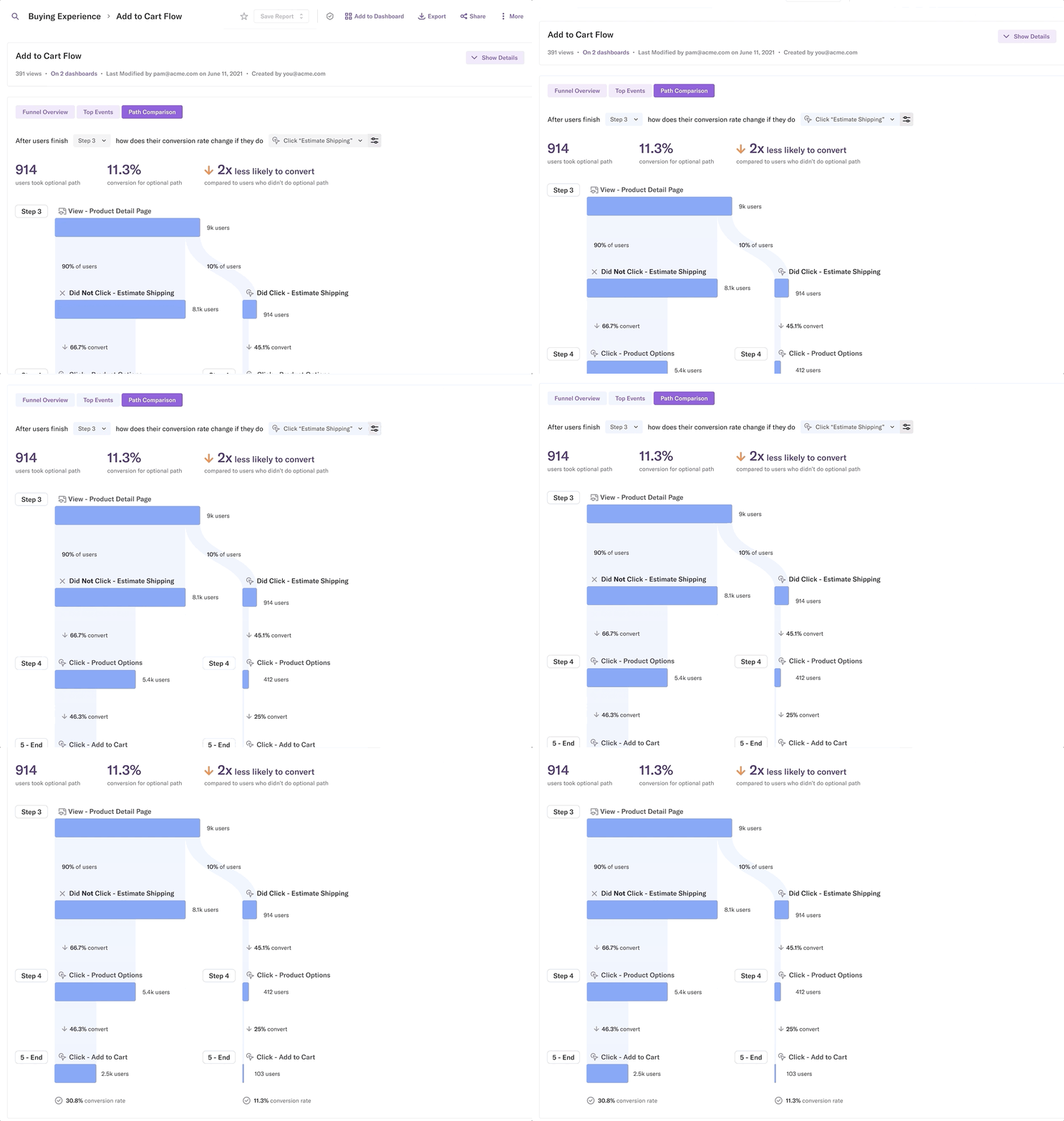
Journey Maps is the only tool on the market that tracks these user choices so you can quickly and accurately understand how every single user behavior affects conversion. Now in beta, check out a preview of Journey Maps below:

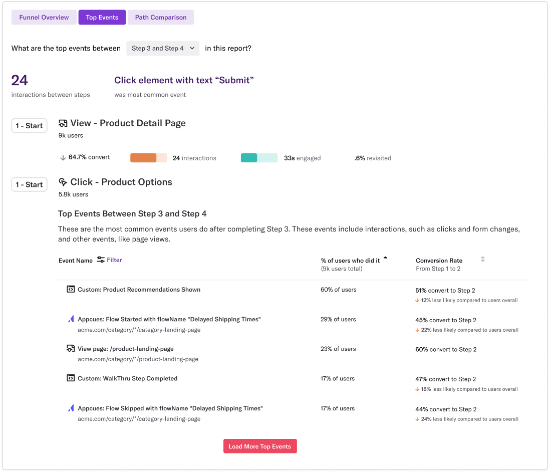
Here’s how it works: Journey Maps shows you the Top Events (the most common ones) that occur between any two steps within a user flow. These events could be interactions, like clicks or form field changes, or page views. You can then choose to view any of these events as a Path Comparison, which compares the paths of users who did the event vs. those who did not.

With this analysis, you can quickly see the number of users who took an optional path, the conversion rate for the optional path, and the likelihood of conversion compared to users who didn't take the optional path.
What this means: you’re able to compare the outcomes of two different user routes (essentially splitting your funnel in two!). If you try to compare the conversion rates of multiple user choices using a typical funnel tool, you’ll end up with the wrong answer. (Don’t believe us? Check out our Insights Report to see why.)
You can know quickly (and with certainty!) the answers to critical questions like:
Are users who complete your optional onboarding flow more or less likely to convert?
If users skip steps, which steps do they skip, and how many skip?
How many users backtrack to previous product pages before checking out?
Do users engage with in-app guides, and are the ones who do more likely to convert?
Do users who read product reviews end up adding more or fewer items to their cart?
How much of an impact would a particular change have on your subscription flow?
Journey Maps provides the answers to all of these questions, and more. Without that information, you’re left to guess what needs to change. With it, you know exactly the right decisions to take.
After all, most product improvements typically begin by looking more closely at optional steps: which user choices should you encourage or discourage and what impact would that have on conversion? Journey Maps gives you immediate, concrete evidence on which user paths convert best (and which don’t) — and where you need to intervene to improve your digital experience.
Now you can finally see the many paths users are taking, how often they skip steps or backtrack to earlier ones, and what detours they take along the way. It’s a new way to understand customer behavior.
Journey Maps shows you the REAL journeys that users take and the impact of their choices as they move through your digital experience. When you see the REAL picture of customer behavior, you can prioritize the product or website fixes that will have the greatest payoff.
Just imagine: no more false starts, dead ends, or wild user chases.
Stop letting bad decisions based on misleading data slow your team down. The digital experience that wins is the one that knows exactly where their users go.
Are you ready to lap the competition by providing an ever-better user experience? Discover real insights based on real user journeys — and achieve real business impact with Heap Illuminate.
Reach out to our team today for a demo!
