Design is for Everyone: 10 Principles Anyone Can Use
Every designer knows the frustration of uninformed feedback. An engineer says the design should have fewer clicks. An executive suggests it should “pop” more. A product manager insists it’s not “intuitive” enough: “I don’t think my grandma would understand this.” Non-designer feedback can be so uninformed, so off-base, so maddening…and yet so difficult to dissuade.
Or maybe you aren’t a designer, and you struggle to provide constructive feedback. You know something’s off with the design…you just can’t put your finger on it. You want to contribute but all you ever seem to do is anger and alienate your designer.
Design is unusual for how approachable it feels. We are unlikely to critique a surgeon’s incision if we didn’t go to medical school; or second-guess a developer’s algorithm if we lack computer science training. But most of us feel qualified to tell a designer what’s wrong with her work.
What’s the answer? Get non-designers out of design? No. In a recent post, “Five Rants from a Cranky Designer,” I wrote,
Design is for everyone. The best products emerge from highly collaborative teams, on which designers are shepherds of design rather than gatekeepers. Where engineers, PMs, marketers, and others are empowered to participate, and educated with an understanding of design so everyone can be a part of creating a usable, delightful product.
That sentiment might make designers uncomfortable. One reader commented, ”You told designers to solve real problems, but then tell them to stop being sensitive and let other people tell them how to do their job.”
There’s a difference between letting everyone participate and letting everyone drive. I can participate in my surgery by deciding to go through with it (or not) after the surgeon frames the decision. But I don’t hold the scalpel.
And the problem isn’t non-designers with opinions; it’s uninformed opinions. We needn’t turn everyone into a designer, but we can arm them with tools to participate productively. So design critiques can include everyone. And when engineers encounter an edge case, a technical limitation, or an inconsistency, they’ll be equipped to address it themselves.
That’s the purpose of this post: to lay out some basic principles of design for everyone. If you’re a non-designer, read it so you can understand where your designers are coming from and give them feedback they value. If you’re a designer, I hope it will help you educate your colleagues to be a more welcome, effective part of the process.
What is design?
Let’s start from the top. Design (roughly) breaks down into three parts:
Product Thinking: Understanding users, defining use cases, and mapping them to functionality.
User Experience (UX): Turning functionality into flows, layouts, and interactions.
Visual Design: Refining layouts, adding motion to flows, creating and applying a look & feel.
Actual role definitions vary. Some teams leave product thinking to product managers. Some agencies refer to visual design as “design” as distinct from UX. And many subdivide: information architects, motion designers, interaction designers, and so on. The role of “product design” typically encompasses all of the above to some degree.
For each of the above, here are a few simple, powerful guidelines that reflect how designers do their jobs and should offer a rubric for evaluating design work.
Product Thinking Principles
Understanding users, defining use cases, and mapping them to functionality.
1. Channel your inner toddler.
Children are exhausting because they ask “why” all the time. Sometimes in answering them we find we don’t have the answers ourselves, and never thought to ask. Design can be the same.
When unearthing user needs, it’s easy to get hemmed in by tactics—what we’ll build, when we’ll build it, how we’ll improve performance—and to lose sight of the who and the why: Who are we building this for, and why will it be valuable to them? So it’s beneficial to keep asking why. Build a habit that feels like checking for your keys: Do we know who the user is, what they’re trying to do, and what expectations and prior knowledge they bring to the table?
Taking it too far: I’ve encountered designers who ask why no matter what, even when it’s just been stated—in which case instead of being helpful and illuminating, they come across as out-of-touch and pompous.
2. Make trade-offs.
You can’t please all of the users all of the time. And while most of us agree on the need for focus, it’s easy for anyone—designer and non-designer alike—to lose sight of it in practice. Ensure you have a specific definition of your user and her needs; then use that definition to prioritize and cut.
Remember, too, that user-facing priority should influence code-facing priority: a crash bug may actually matter less than a visual glitch, depending on its impact; and buttoning up all the edge cases is only relevant to the extent anyone sees them.
3. Know your user.
Your users approach your product with expectations that don’t match yours. Even when you nominally fit the user profile, your superior understanding of the product means you’re still not the user. Optimizing for yourself, or your colleagues, can mean missing product-market fit.
But you can’t just ask users what they want: they’ll generally propose incremental improvement and balk at more fundamental change. Instead, treat user feedback as a clue: something isn’t working, and they’re describing it in familiar terms. You have to do the detective work to figure out what it really is.
For example: In 2006, User Interface Engineering studied perceived vs. actual load times for e-commerce sites and reached a surprising conclusion:
When we looked at the actual download speeds of the sites we tested, we found that there was no correlation between these and the perceived speeds reported by our users…[but] a strong correlation between perceived download time and whether users successfully completed their tasks on a site.
In other words, users were experiencing a usability problem and perceiving it as a performance problem. “Your site is slow,” then, is a valuable clue but perhaps not the full story. User research techniques can be incredibly valuable here: they help us learn about users rather than just from them.
User Experience Principles
Turning functionality into flows, layouts, and interactions.
4. Focus on cognitive load, not click-counting.
This one has plagued designers since the invention of the mouse. It’s tempting to equate fewer clicks with better design, but easy to see how that breaks down for a product of any complexity: We can reduce the number of clicks to simply by exposing every command. Instant usability!
The trouble with click-counting is that not all clicks (or taps, or keystrokes) are created equal. When there’s too much onscreen, cognitive load (time and effort spent thinking) is incredibly high—and indeed cognitive load often varies from click to click.
Reducing cognitive load is especially important for commonly-used functionality, because frequent use allows people to *habituate—*to move the task into muscle memory, after which it stops being conscious (like tapping the brake to slow your car). Subconscious effort doesn’t feel like effort, and doesn’t interrupt the flow of thought. It’s a far more important goal than reducing clicks, even if the results often look the same.
5. Design for user expectations, not your database.
Designers use the term mental model to refer to the user’s internal, mental representation of the task and product at hand. We talk about creating the mental model, but that’s really a shorthand: the user creates the mental model in her head by combining what she sees in the UI with her expectations based on past experience. If the data model is how we persist our product on the back end, the mental model is how we persist it in the user’s head.
The data model and the mental model have different requirements and rely on different types of system. So while it can be convenient to align the two, it’s often undesirable.
For example: Suppose we’re building a to-do list app. People should be able to categorize tasks into projects, and break down more complex tasks with checklists. As we build, we’d like a data model that’s future-proof, flexible, and simple—so we create a single tasks table in our database. By linking tasks to other tasks, we can represent projects and checklists, too.
And it’s tempting to do the same in our UI: instead of dedicated concepts for projects, tasks, and checklists we could have a single, super-flexible task object. But the very simplicity that makes this a great data model actually looks like complexity to the user: she needs to think harder (cognitive load again) to grasp this multipurpose notion. And that flexibility means there’s more than one reasonable way to map her to-do list onto it. She has to make choices, and at a point where she’s new to the system and therefore uninformed (and perhaps unmotivated to keep going).
6. Usability is relative.
In discussions of UX, we sometimes employ phrases like “more intuitive” or “less usable.” These are convenient shorthands, but can be misleading because they’re not one-dimensional. What’s usable is relative to your user and her needs—so in pursuing great UX, we make informed trade-offs between different dimensions of usability.
For example, Apple Photos and Adobe Lightroom both let you manage your photo library, but take very different approaches:

Apple Photos (left) and Adobe Lightroom (right). Which is more usable?
Apple’s approach is discoverable and approachable, Lightroom’s powerful and efficient. But neither is more usable—they’re just for different people. (A Lightroom user might accurately describe Apple Photos as limited or simplistic, and an Apple user might find Lightroom bewildering and chaotic.)
7. Humans are irrational.
As we visualize our user, we often compare her brain to a computer, taking in our product and processing it. And the brain is a computer—in the same sense that a camel is a vehicle. It gets from point A to point B, but there are some interesting bumps along the way.
Computers are good at logical, linear calculations. Step-by-step workflows. Reminders. You can rely on them to take in all the inputs, do the math, and arrive at the same result each time.
Humans are terrible at these things. What’s worse, we think we’re good at them. We make decisions and then rationalize them after the fact. We’re bad at arithmetic. We forget stuff. We lose track of time. We jump to conclusions. We give too much weight to information that confirms our preexisting beliefs. We see cause and effect where even correlation is dubious. We’re fundamentally lazy. We can’t hold very much information in our heads.
But here’s the good news: it’s not all downside with the human brain. We may be bad at math, but we can answer crazy questions like, “Which is better, the color blue or a tuna sandwich?” We can’t make complex logical decisions, but we can make incredible intuitive leaps. We can synthesize information and detect patterns in an instant. We can perform insanely complex calculations in the act of catching a ball, then push that knowledge into our subconscious until it feels effortless.
Why does this matter for design? Because if we build a product for rational, logical users they’ll display irrational, illogical behavior in using it. And if we fail to understand why, we’ll blame the user instead of the product. For more, read my post on the subject.
Visual Design Principles
Refining layouts, adding motion to flows, creating and applying a look & feel.
8. Reduce differences.
I originally called this one, “Less is more,” but you know what that means, right? Less stuff onscreen. Fewer buttons. Clean, spartan.
That’s not what I mean—because in fact, “less is more” doesn’t mean much of anything. It describes an end state, but not a principled way to get there.
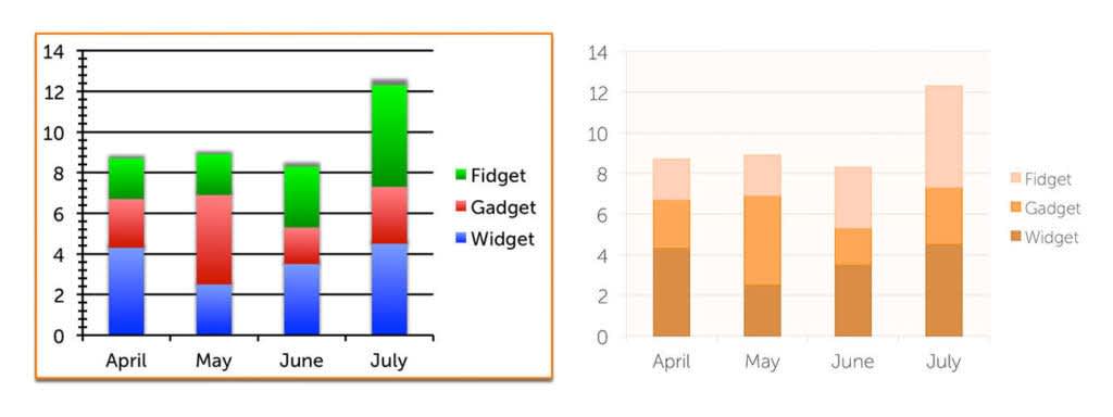
Instead, we achieve simplicity by applying focus to use cases and priorities—at all stages of the design process. When it comes to visual design, we can apply the smallest effective difference principle: “Make all visual distinctions as subtle as possible, but still clear and effective.” (Edward Tufte, The Visual Display of Quantitative Information.) That is: when things need to be distinct from one another, ensure your user can perceive that distinction but don’t go any farther than you have to.
This does need to be balanced with accessibility, legibility, and some aesthetic considerations; even so, if there’s one principle that guides my design work more than any other, this is it.

By applying the “smallest effective difference” principle we increase legibility and understanding, and reduce chaos. Image pulled from my own 2014 post in Smashing Magazine.
Some of this boils down to consistency: Don’t make things different if they can be the same. In fact, think twice about making things different even when there’s some justification for them to differ. More often than not, it reduces cognitive load, improves aesthetics, and even lowers engineering effort.
9. Create visual hierarchy.
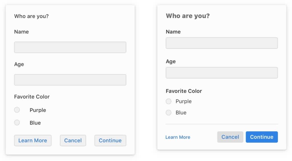
Visual hierarchy refers to the deliberate use of color, size, typography, spacing, and other visual attributes to (a) determine the relative prominence of elements onscreen, and (b) indicate logical grouping. It’s a critical, everyday tool for choice architecture and, if we’re getting grandiose, allows us to implement libertarian paternalism: guiding the user’s actions without actively restricting them. In more mundane terms, it helps us achieve simplicity without sacrificing discovery or efficiency.

The design on the left is consistent and clean, but hard for the eye to parse. On the right, we introduce visual hierarchy via variations in type, color, size, and spacing.
10. Line stuff up.
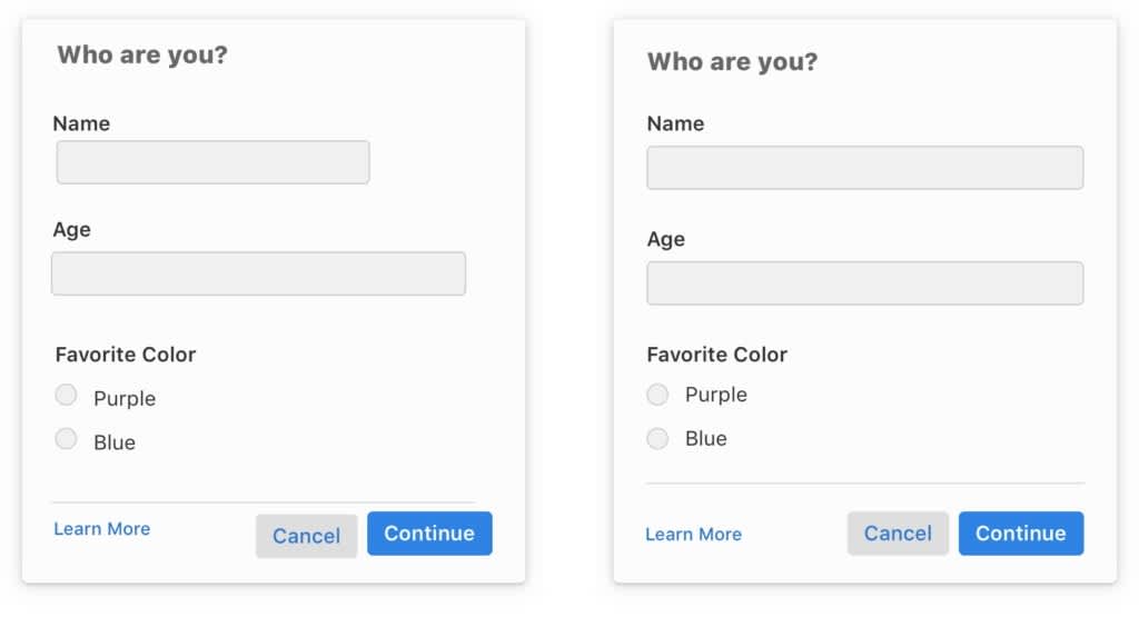
Despite being really straightforward and powerful, this principle accounts for maybe 75% of my feedback to engineers when designs are implemented. Here it is, in full: If stuff is near other stuff, line up the stuff with the other stuff.

On the left, stuff is not lined up with other stuff. On the right, stuff is lined up with other stuff.
It really is that simple. If things are near each other in either the x or y dimension, ensure they line up along the relevant axes. Avoid sizing similar things differently. Use consistent spacing between things.
Note that what matters here is optical alignment, not mathematical. Especially when we’re dealing with non-square elements like text and icons, things can be lined up mathematically and still look misaligned. Sometimes we have to live with that to avoid one-offs, but ideally we go with what looks right.
(You may have heard designers talking about “the grid.” They’re referring to a simple tool for implementing this principle. We establish an invisible grid—typically 4px or 8px for some reason—that covers the whole screen. Then we ensure everything aligns with it, down to the line height of our text. It achieve a sense of consistency that a mere manual effort wouldn’t achieve.)
• • •
Note that these are guidelines, not immutable rules—and they often trade off against one another. In part, design exists as a discipline because we can’t reduce it to an algorithm. Principles guide us but don’t solve problems for us.
Conclusion
There are plenty of design principles I haven’t listed here. I’ve selected these particular ones as easily-understood guidelines to aid designers and non-designers alike in critiquing design work—and to provide a window into how designers think. I’m eager to hear feedback from non-designers: Was this helpful? Will it let you participate more comfortably in the design process? And I’m eager, too, to hear from designers: What did I miss?
Last but not least, a shameless plug. I’m actively building a design team from the ground up at Heap. We’ve got fascinating problems to solve and smart, humble, quirky people to solve them. Just as importantly, we have an opportunity to build the kind of collaborative, cross-disciplinary design process I’m talking about here. If you’re a designer and enjoyed this (as well as my other writing), drop me a line or check out the job posting on our website.
Thanks to Frances Yun and Timery Crawford for their editorial and proofreading help.
